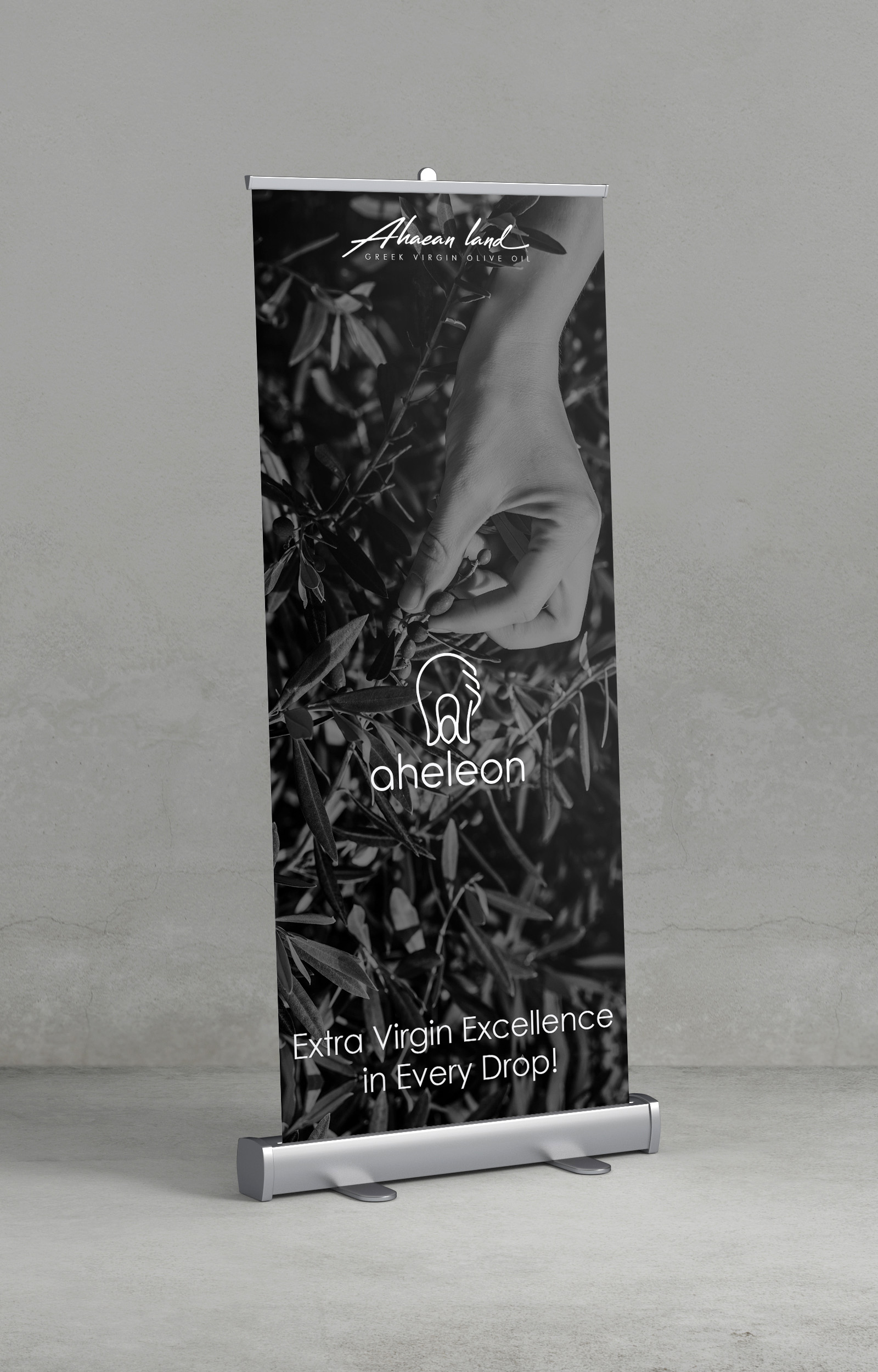
For the development of the olive oil packaging project with ceramic containers, the agency began by finding a name, designing the logo, and completing all the applications of the brand’s visual identity. The name AHELEON emerged from the combination of the words Achaea, referring to the region “Achaia,” and “eleon”, meaning olive oil.
Achaea is part of the region of Western Greece and is situated in the northwestern part of the Peloponnese peninsula.
The olive oil of the brand is produced in this region.
Design
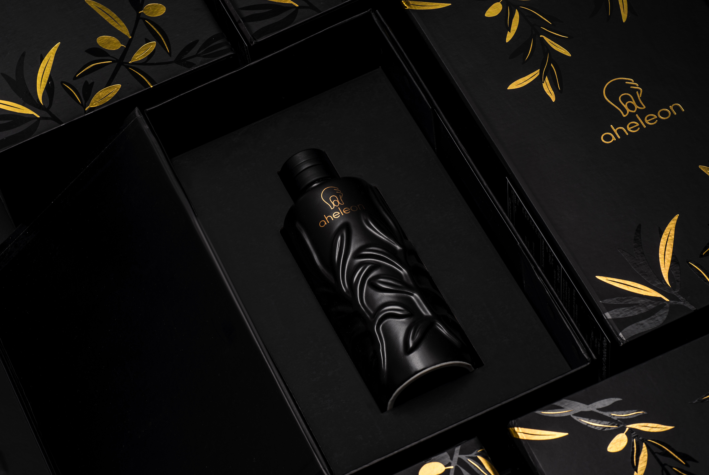
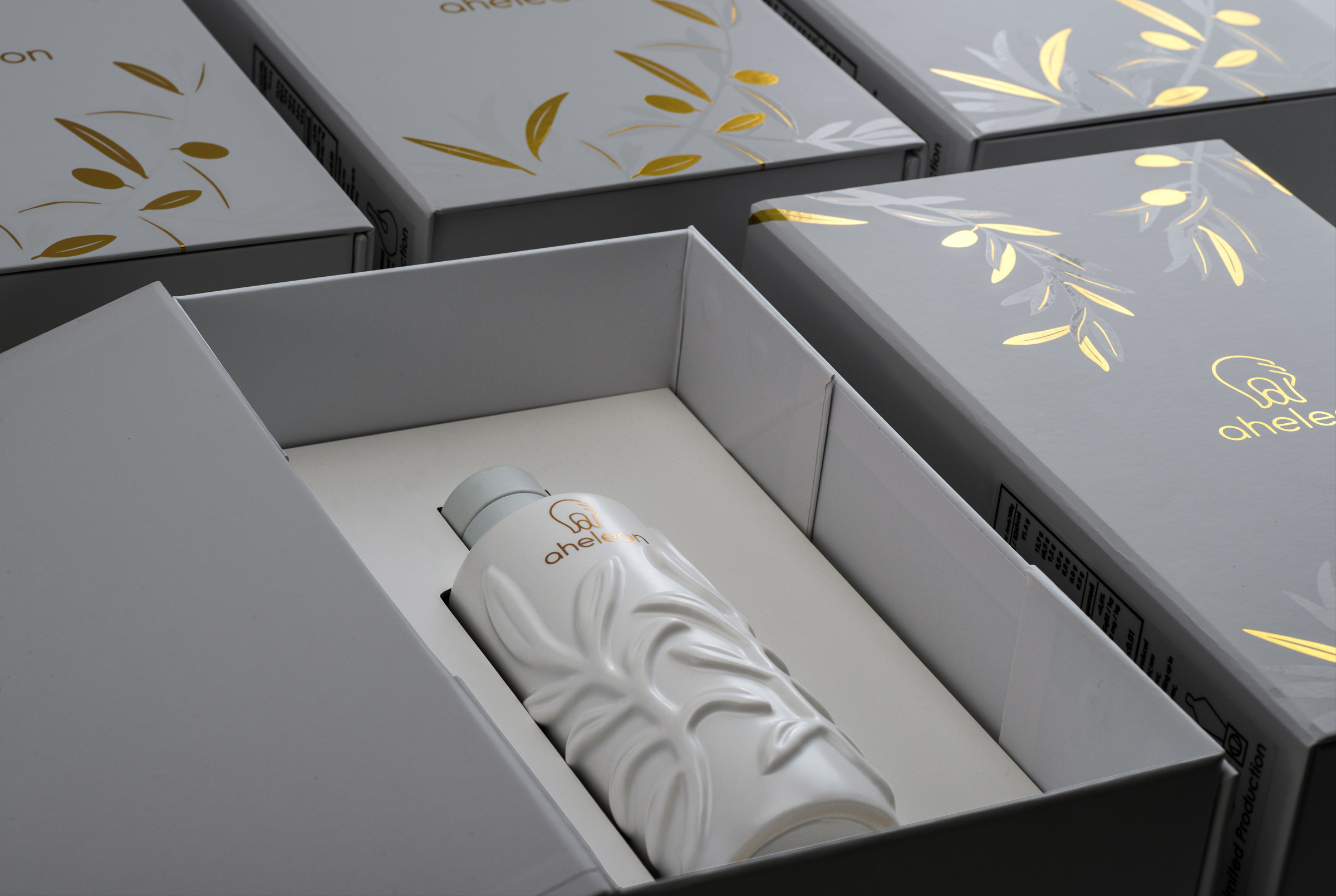
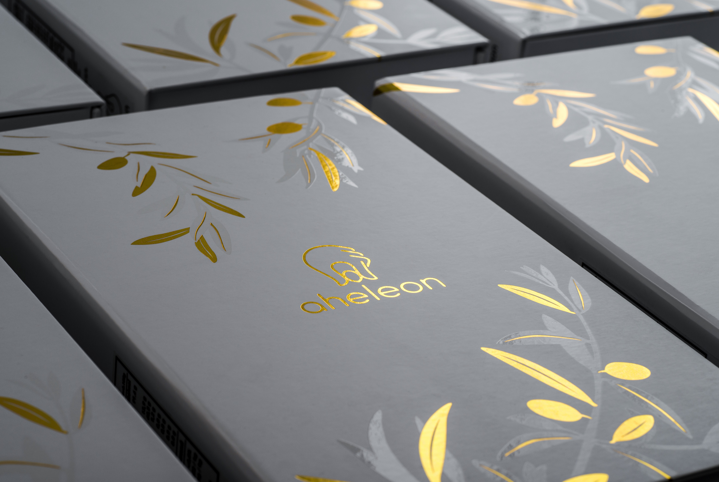
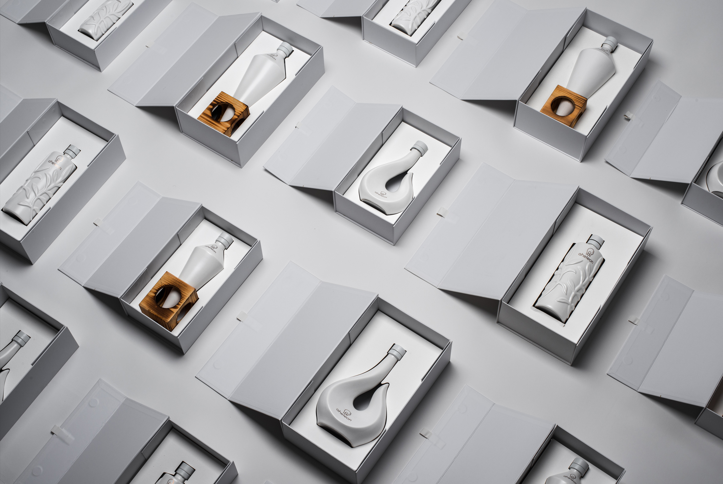
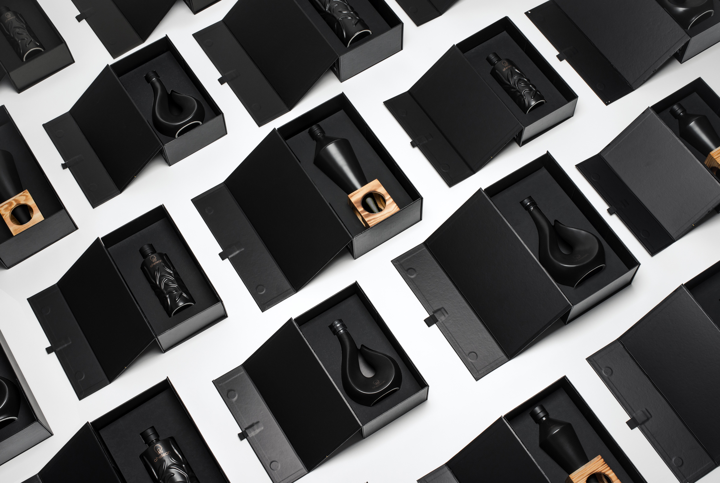
Both the specialized cultivation management and the high-standard production process led our office to design the logo with two fingers holding an olive fruit. The logo directly symbolizes the refined management of the fruit from cultivation to the bottling of the final product. Our office handled all visual communication applications for the brand.
Services
-
Concept / Naming / Brand Strategy
-
Printing applications
-
Social media content
-
Photography