Ampelos company is active in the area of juice processing and deriving products from Greek grapes for the industrial use in the food industry. The marketing executives of the company have asked form our office to create a robust visual identity that fulfils the following conceptual requirements:
- Greek raw materials
- Natural/purity of the raw material/product
- Conversion
- Grapes
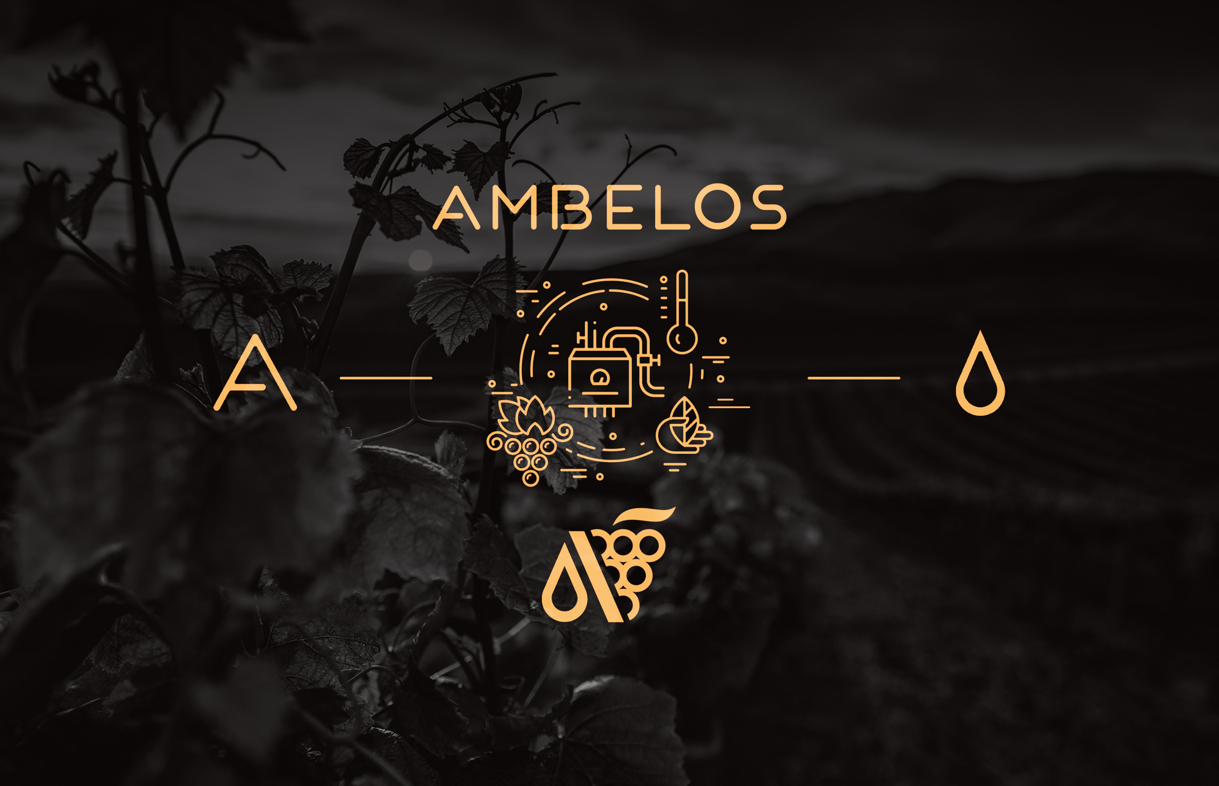
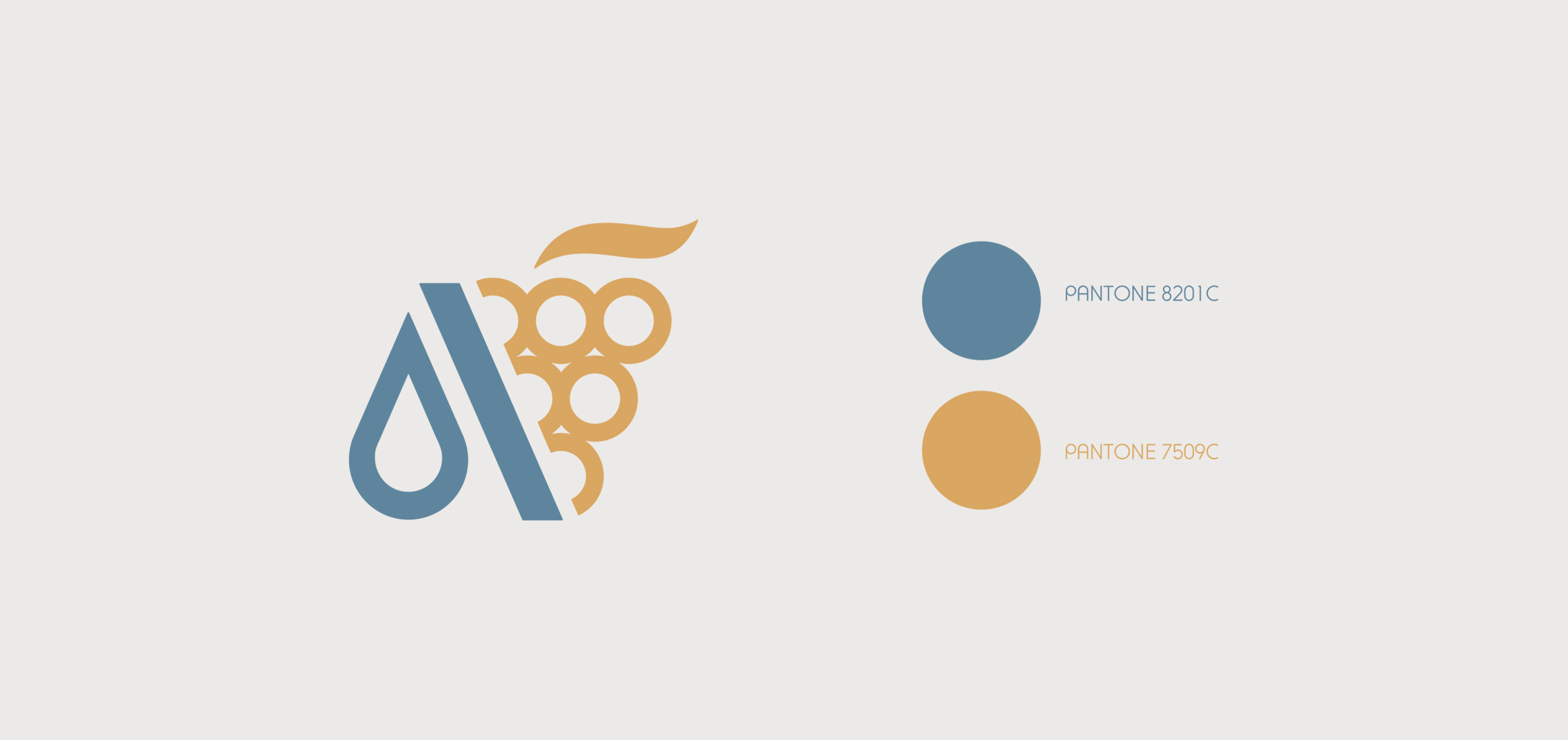
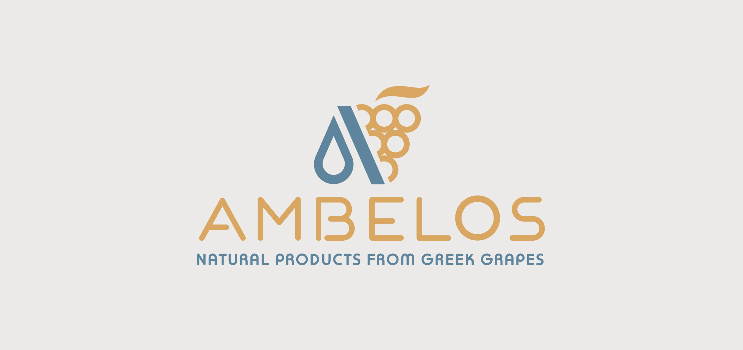
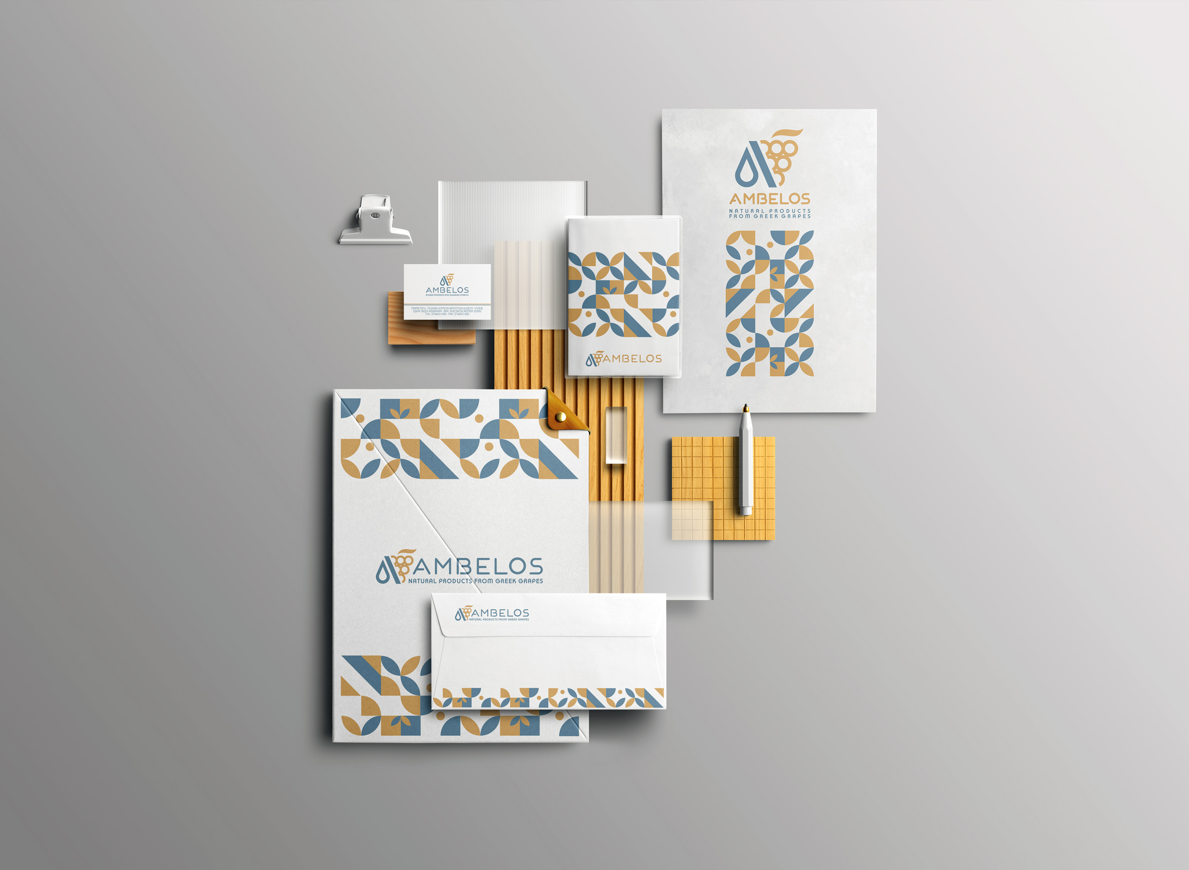
The design
Symbolism:
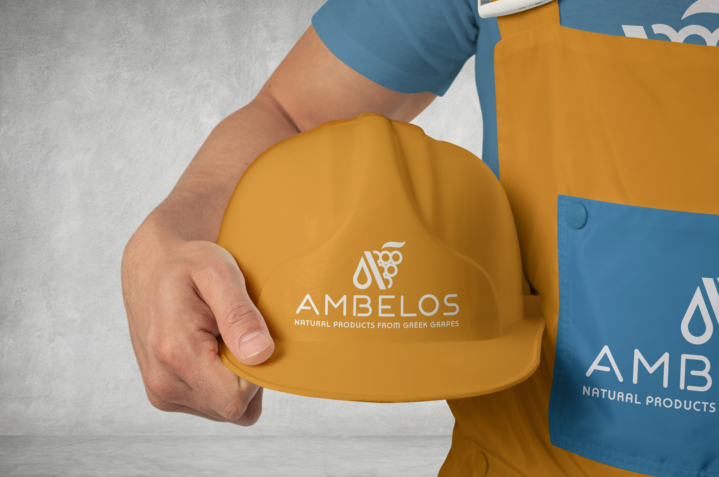
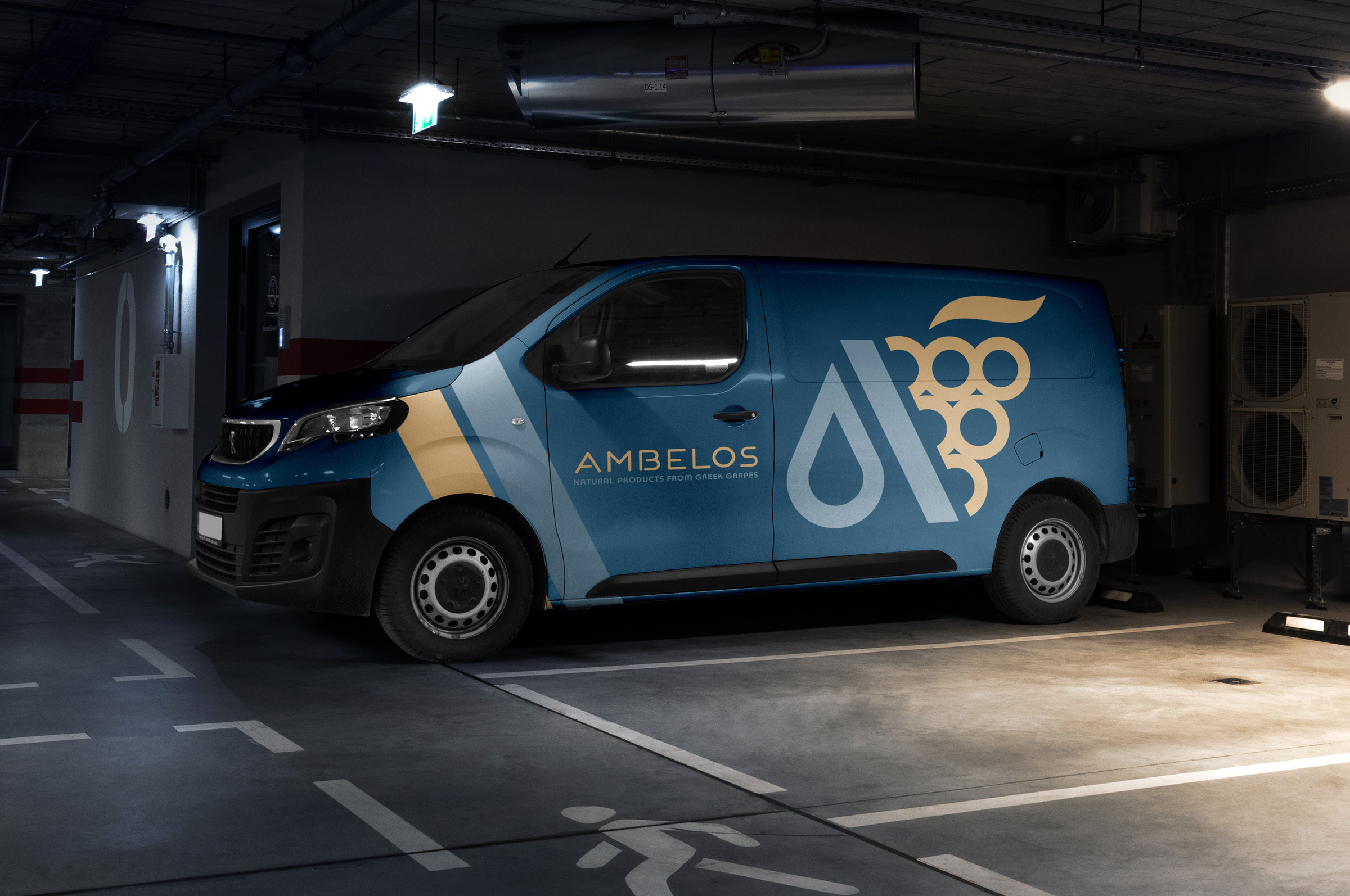
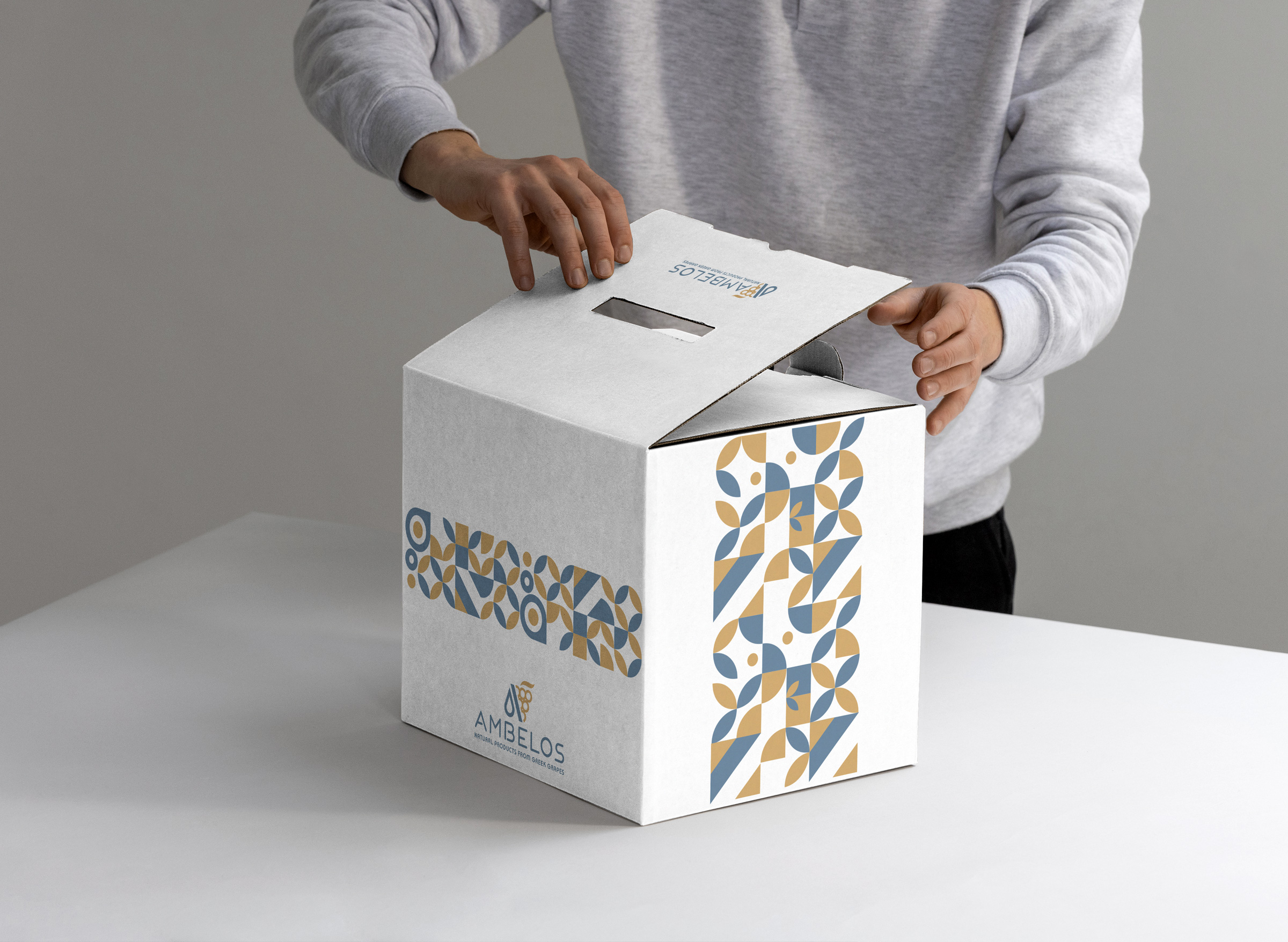
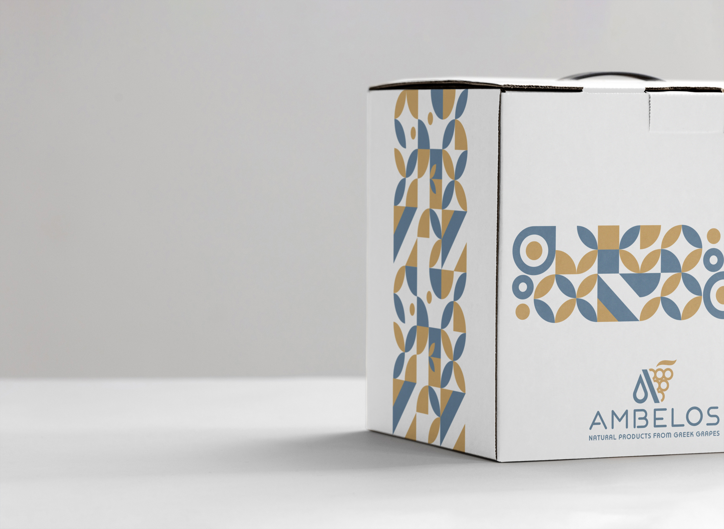
The first letter of the brand (Α) has a central place in the logo, helping memorise the name and the logo itself and symbolizing the A quality of the raw material and the final produce. For depicting the natural quality of the raw material we are using the grape with the leave. For the visual depiction of the final produce we are using the symbol of the drop since all products are in liquid form. The concept of conversion is depicted through the use of the slash line in one of the legs in the letter A.
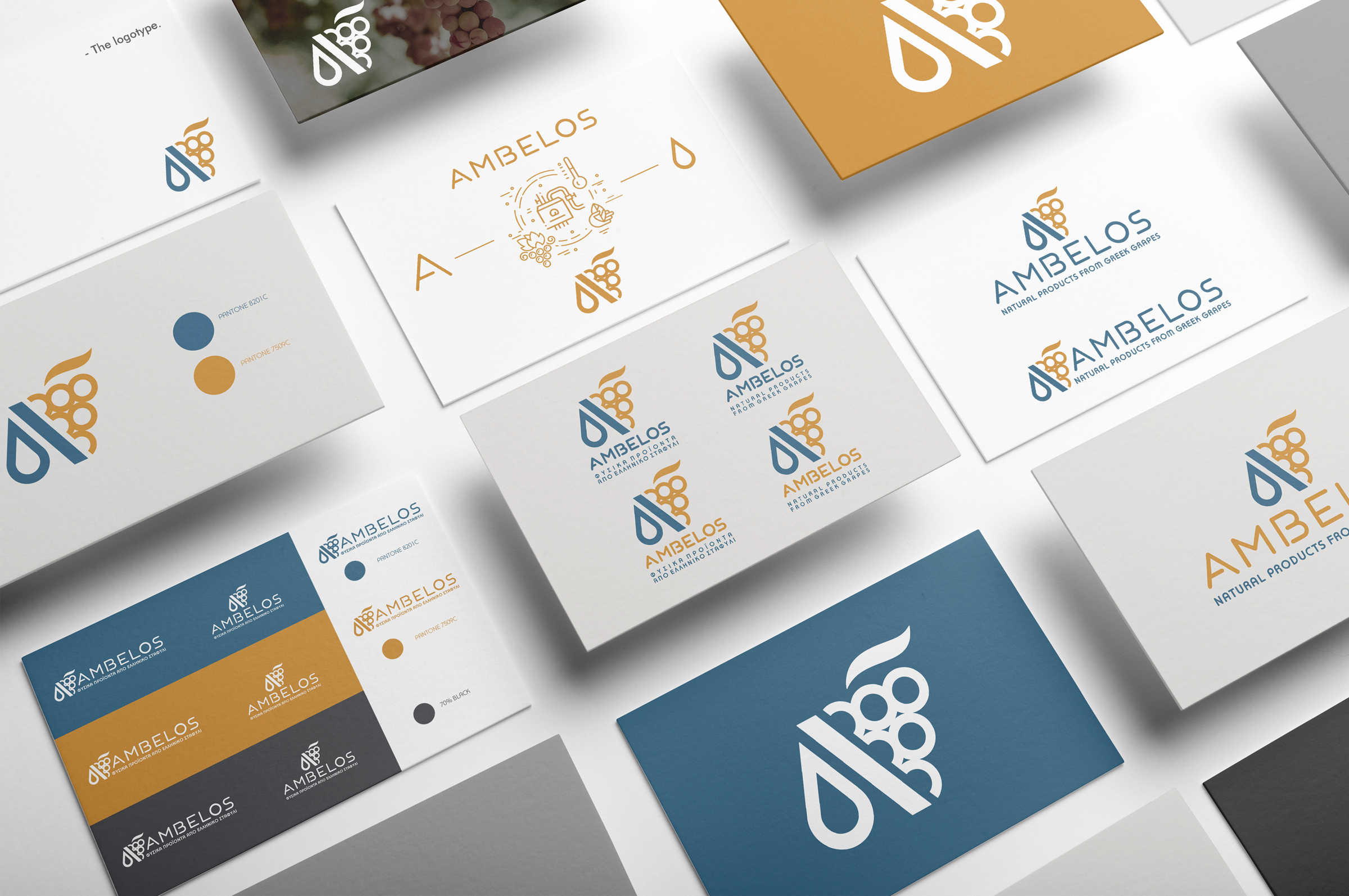
Services
-
Brand development
(Concept – Logo design – Visual identity)
-
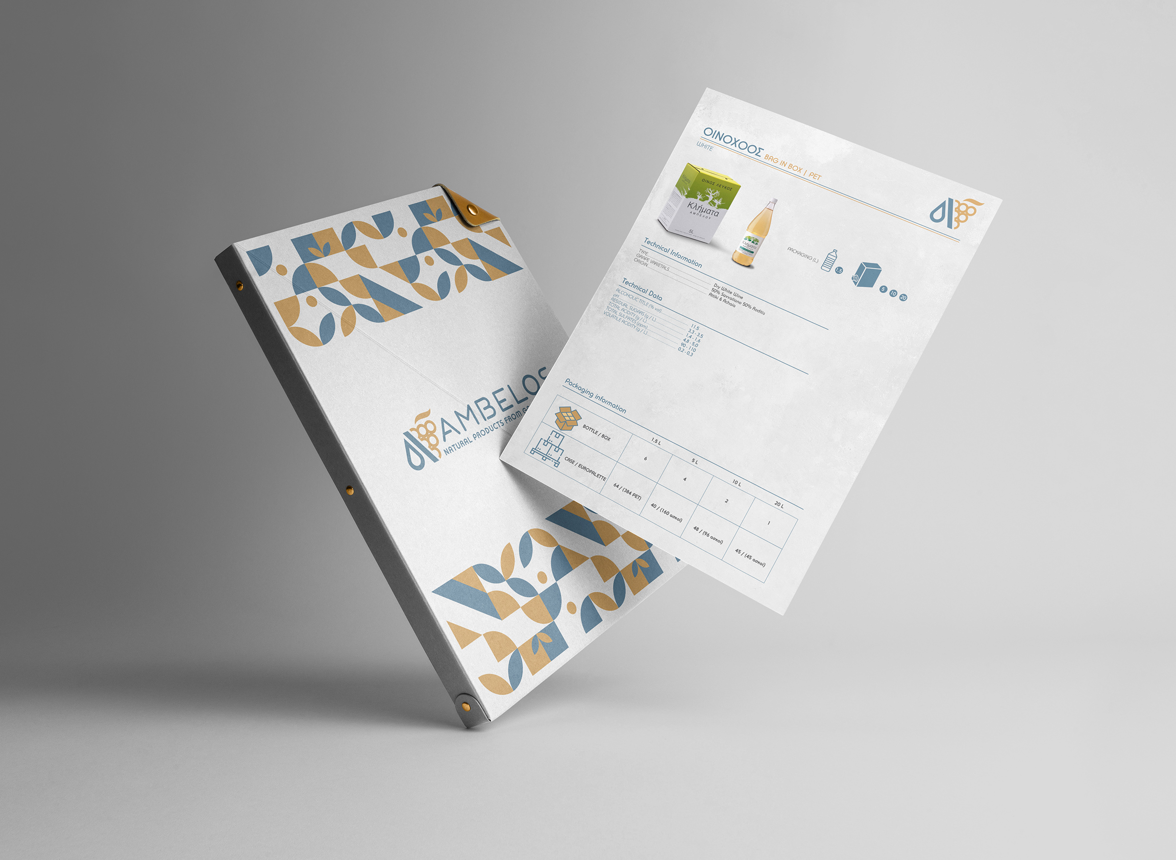
Corporate identity applications