The Mouriki family has been active in apiculture since 1960. A tradition of 60 years in the fascinating world of the bees. The exclusive use of nomadic beekeeping in the 2500 beehives, in combination with the rich efflorescence in every season, contribute to high-quality honey of 5 different varieties. The transition of their commercial management from wholesale to retailing brought the Mouriki family to our studio. The priority was the redesign of their company identity, followed by the construction of advanced packaging that would highlight the dynamic entry of the brand in the premium retail market.
Design
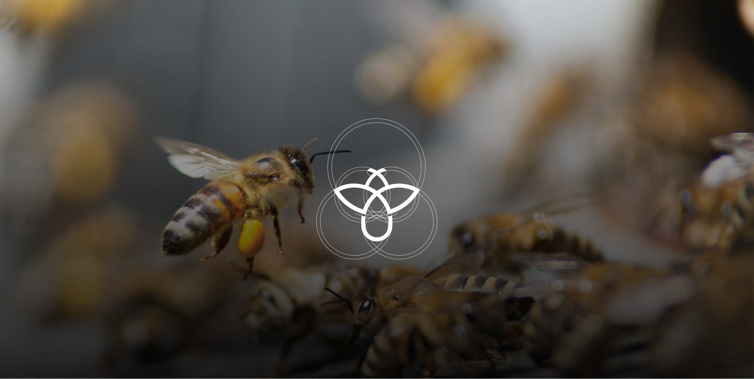
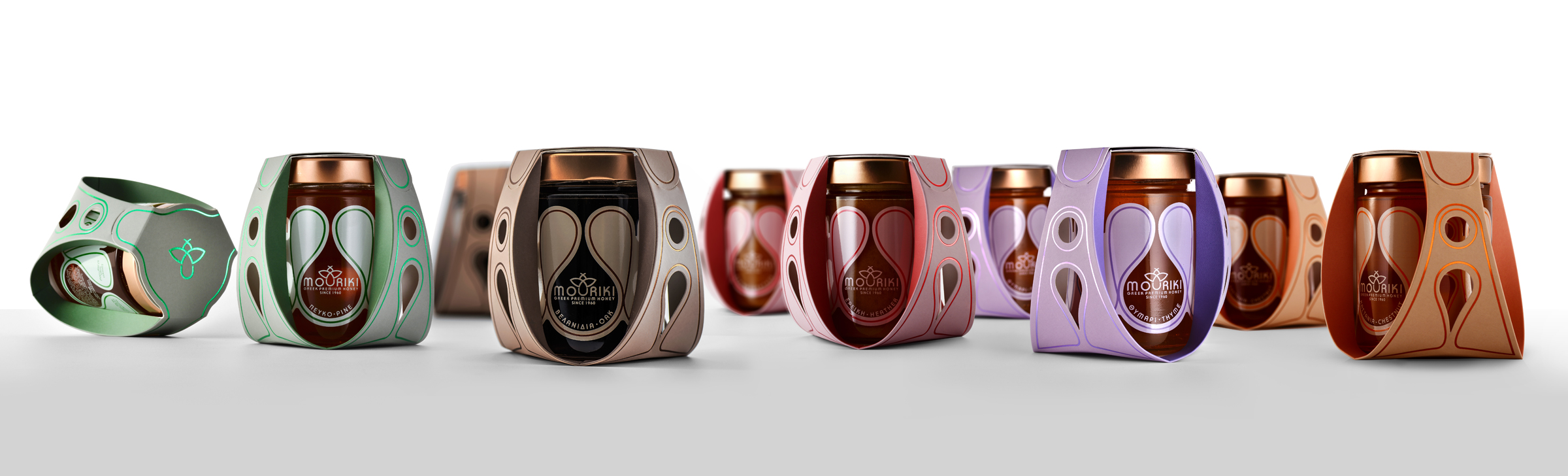
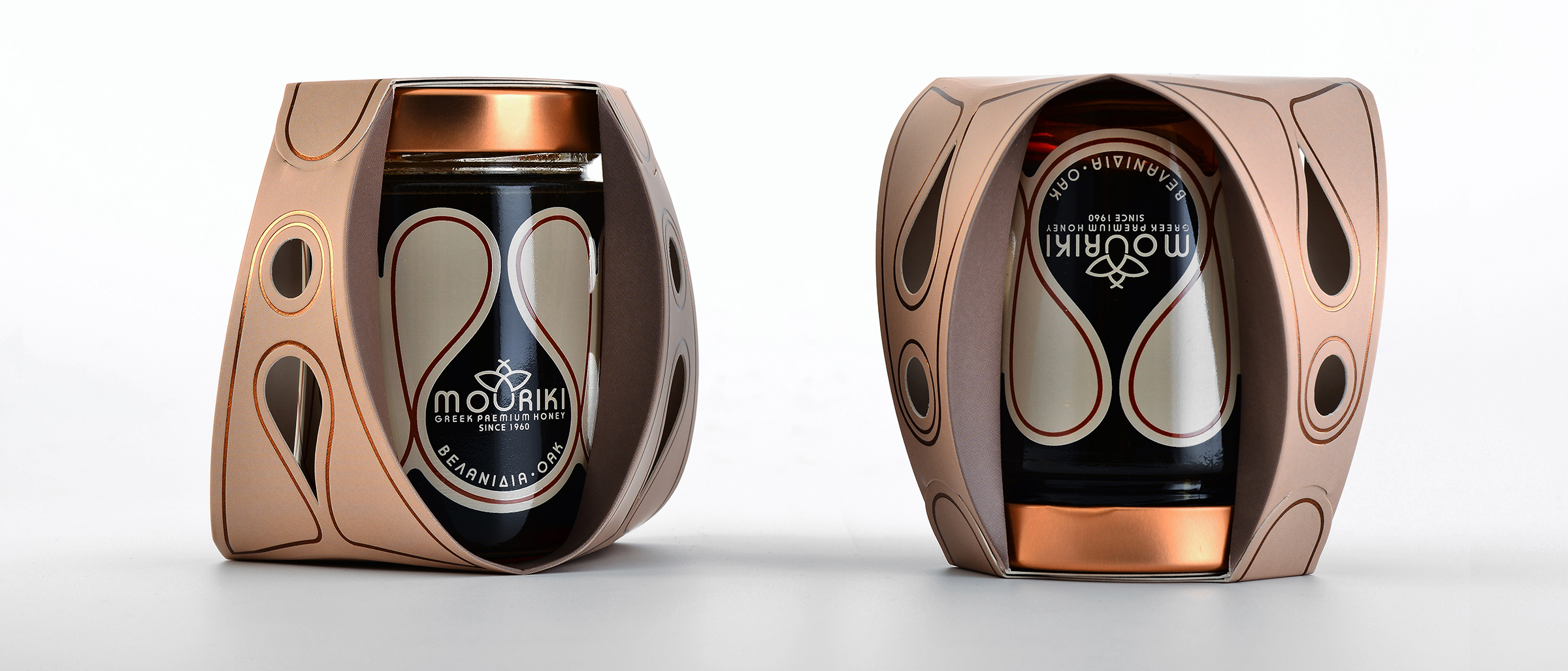
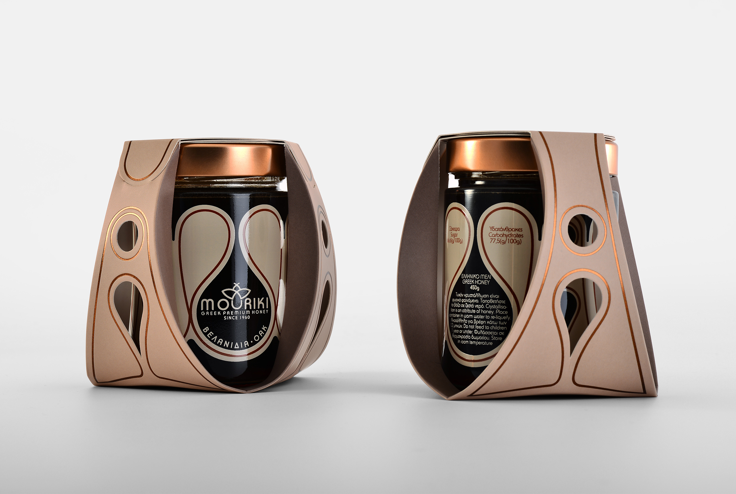
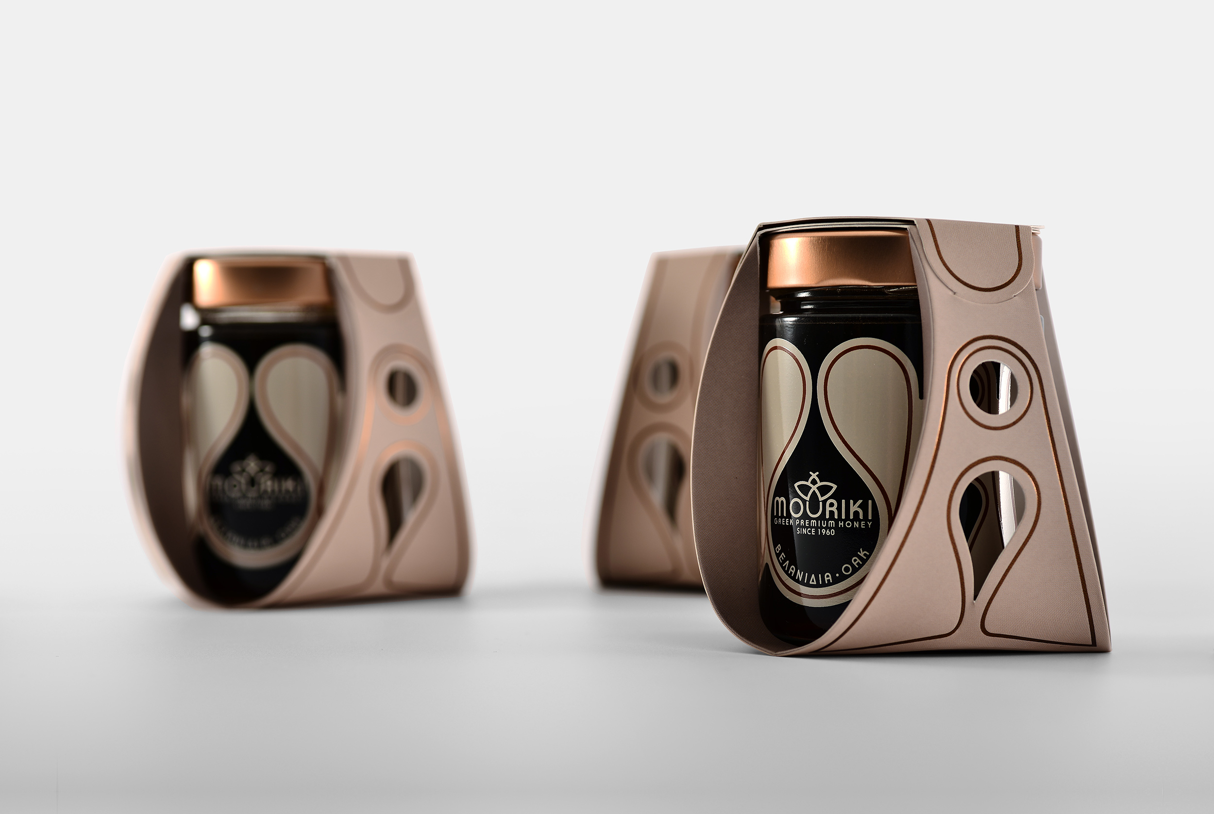
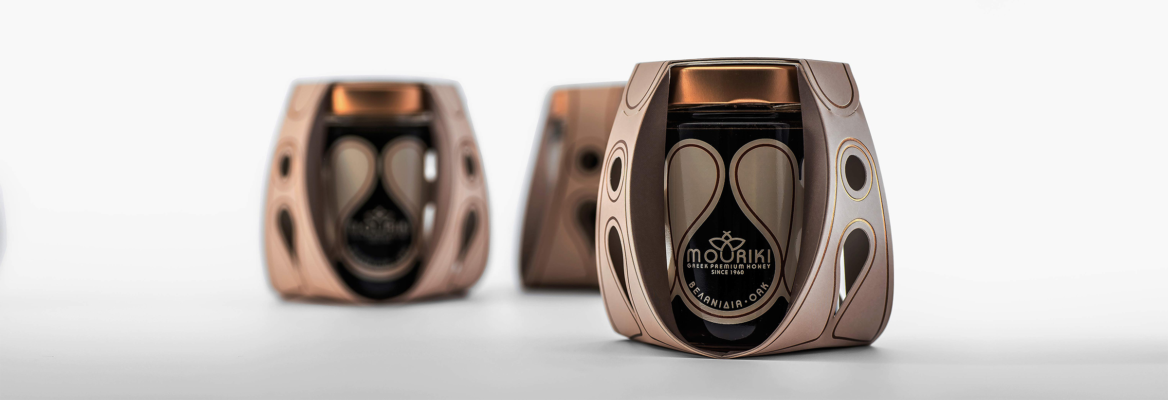
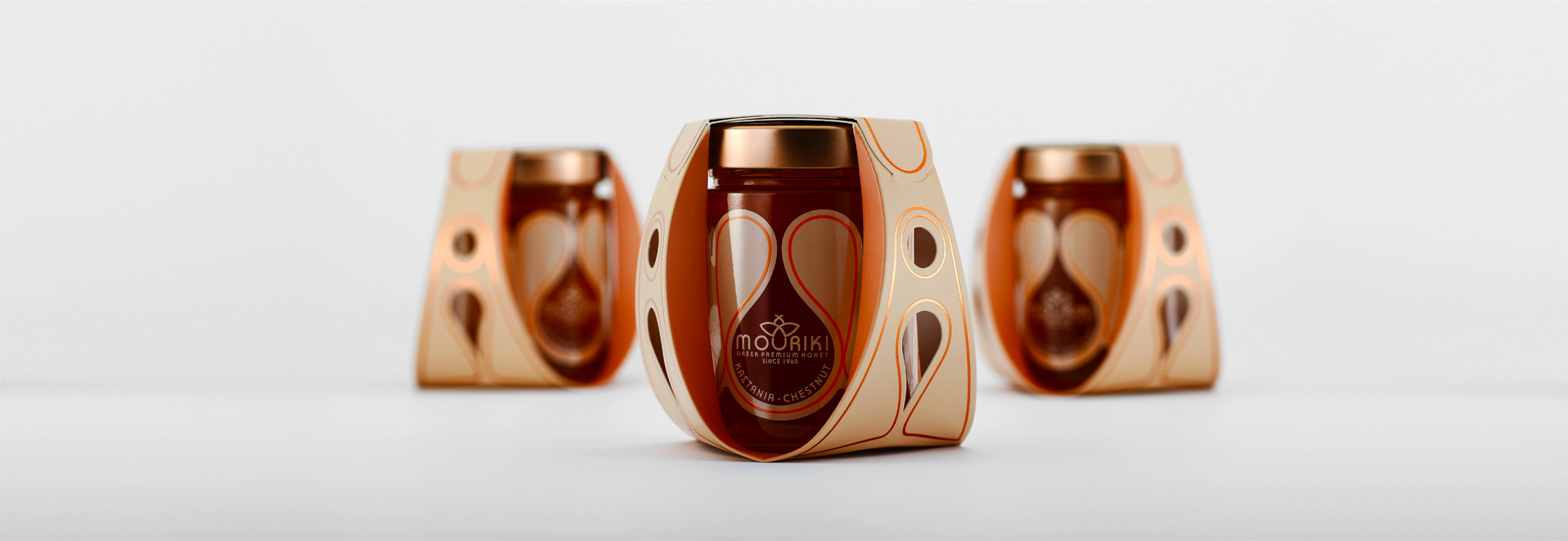
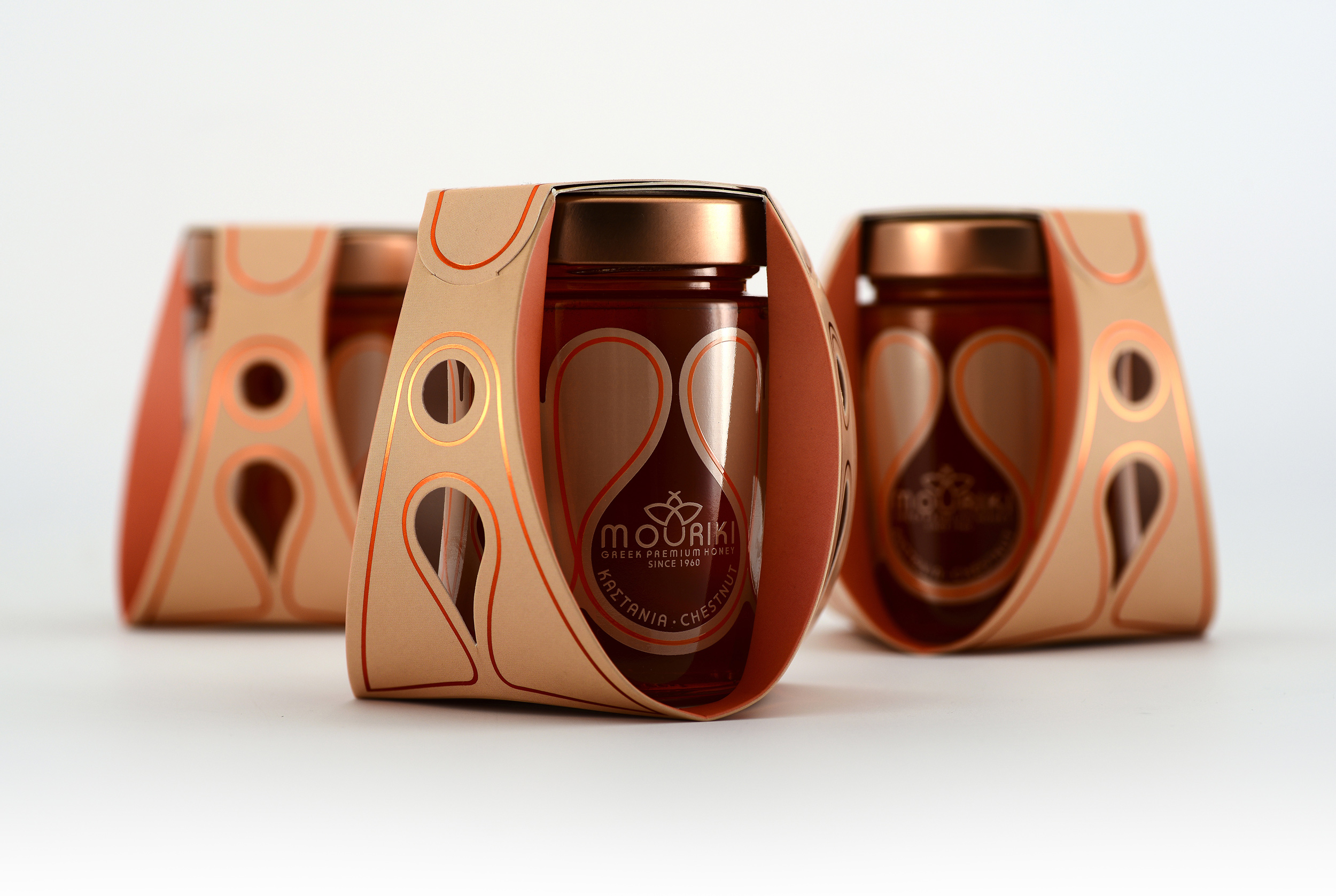
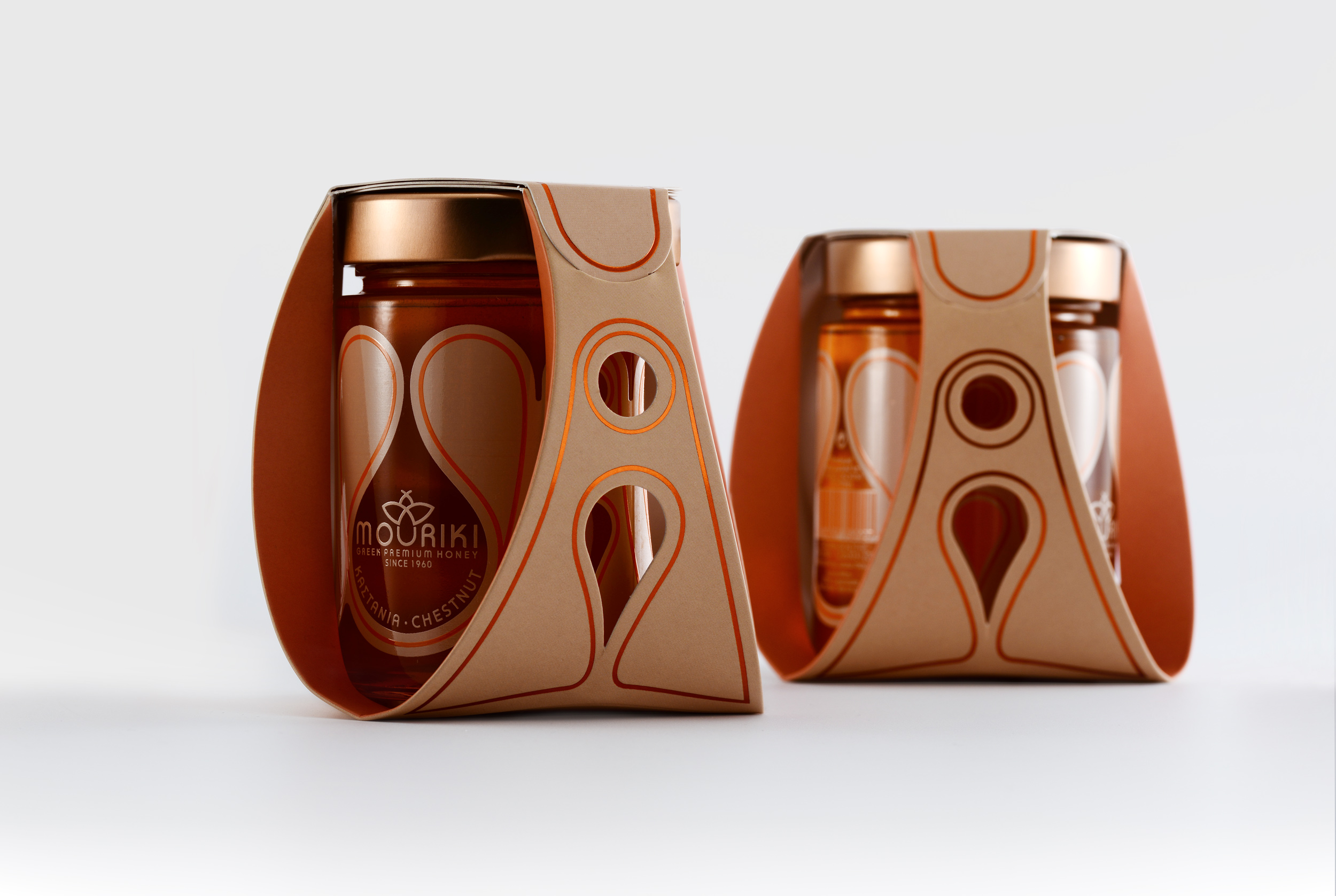
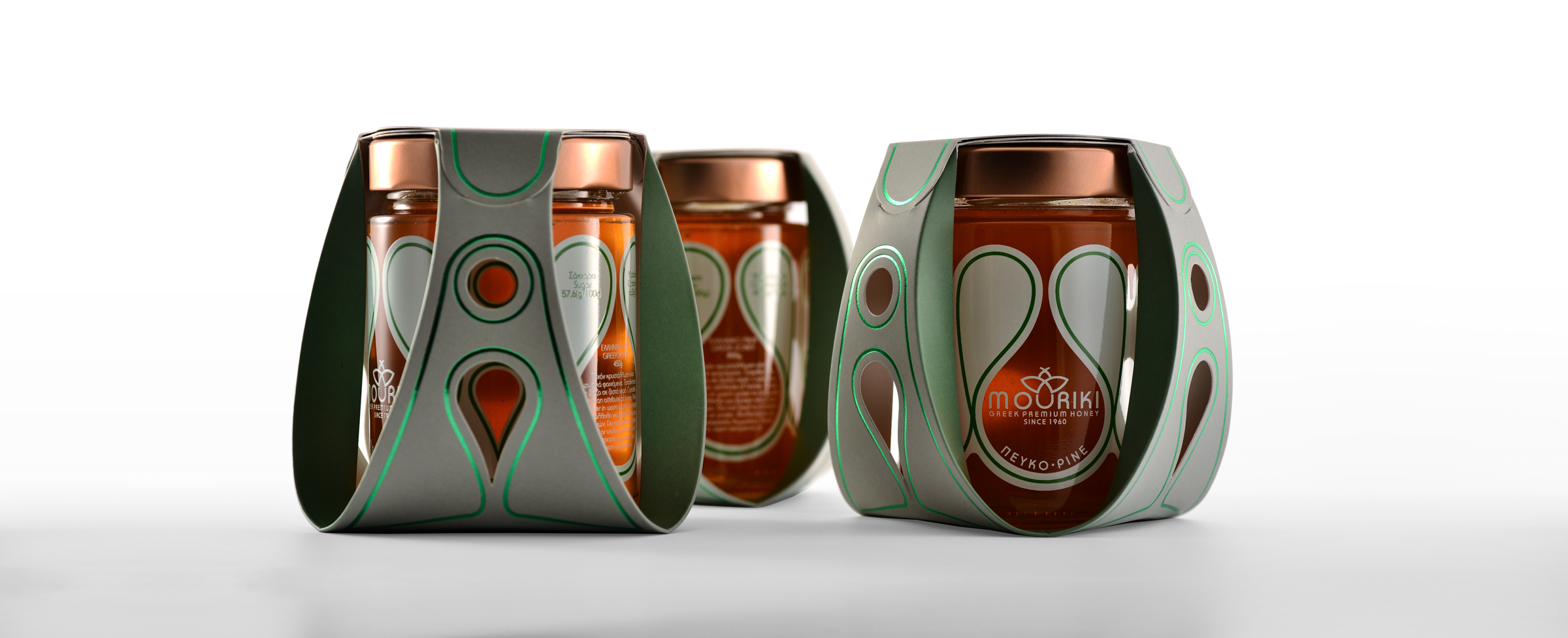
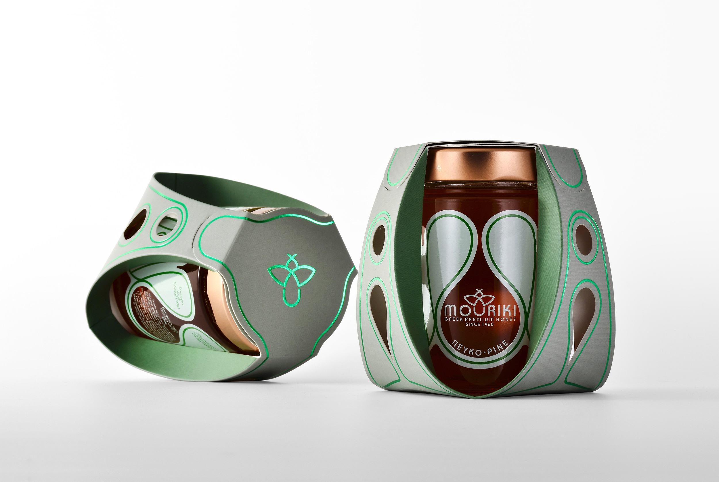
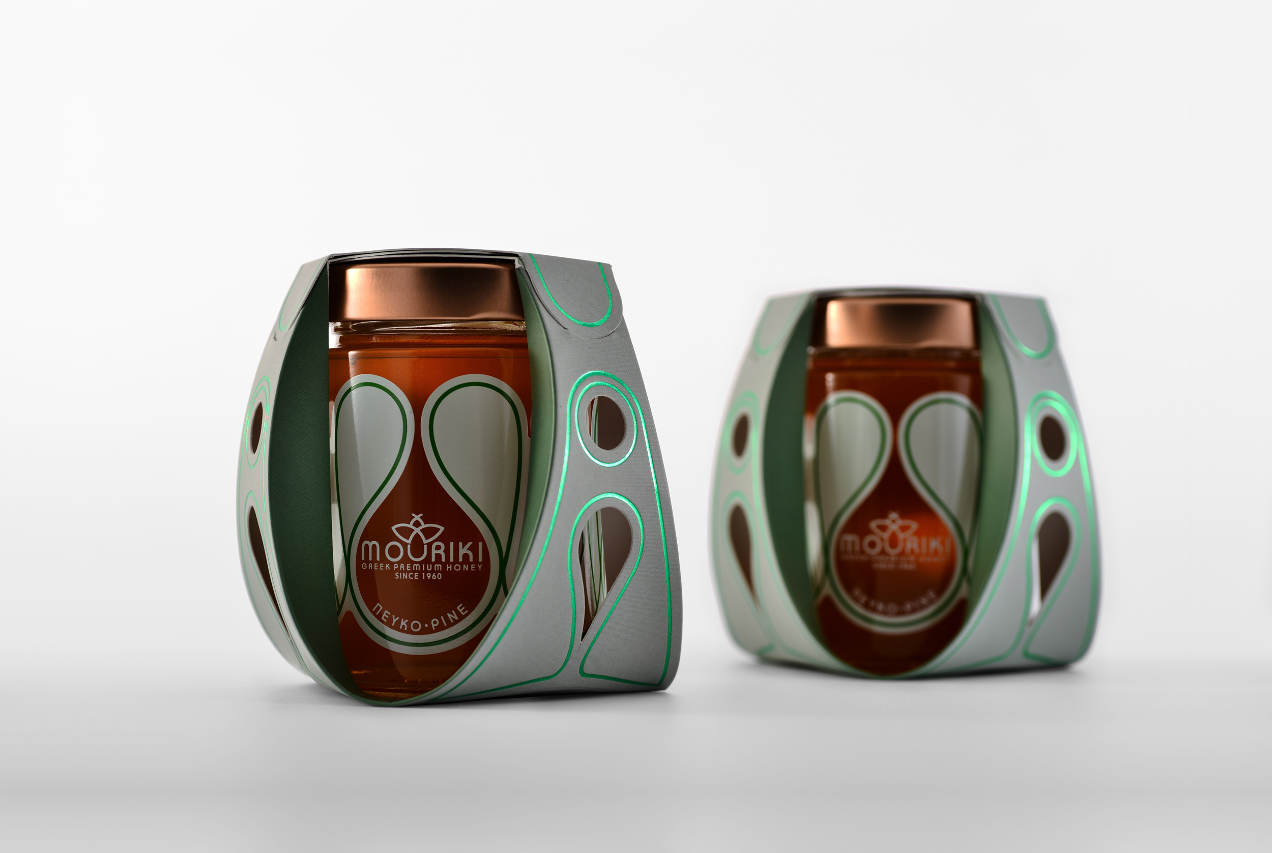
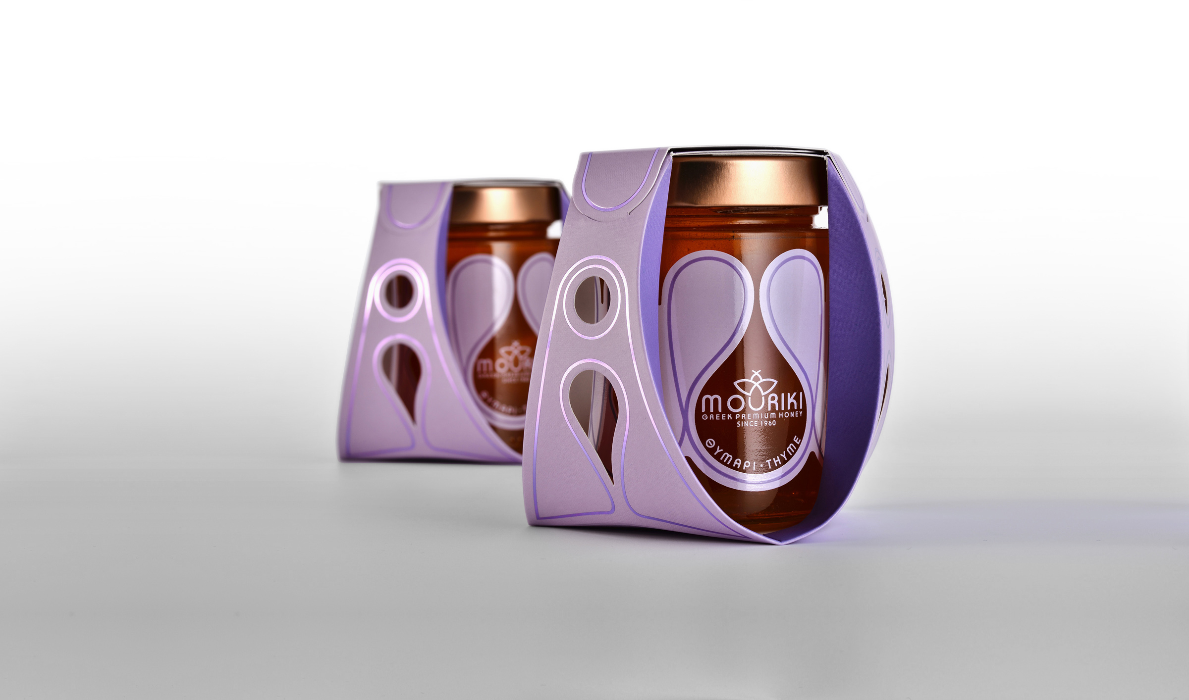
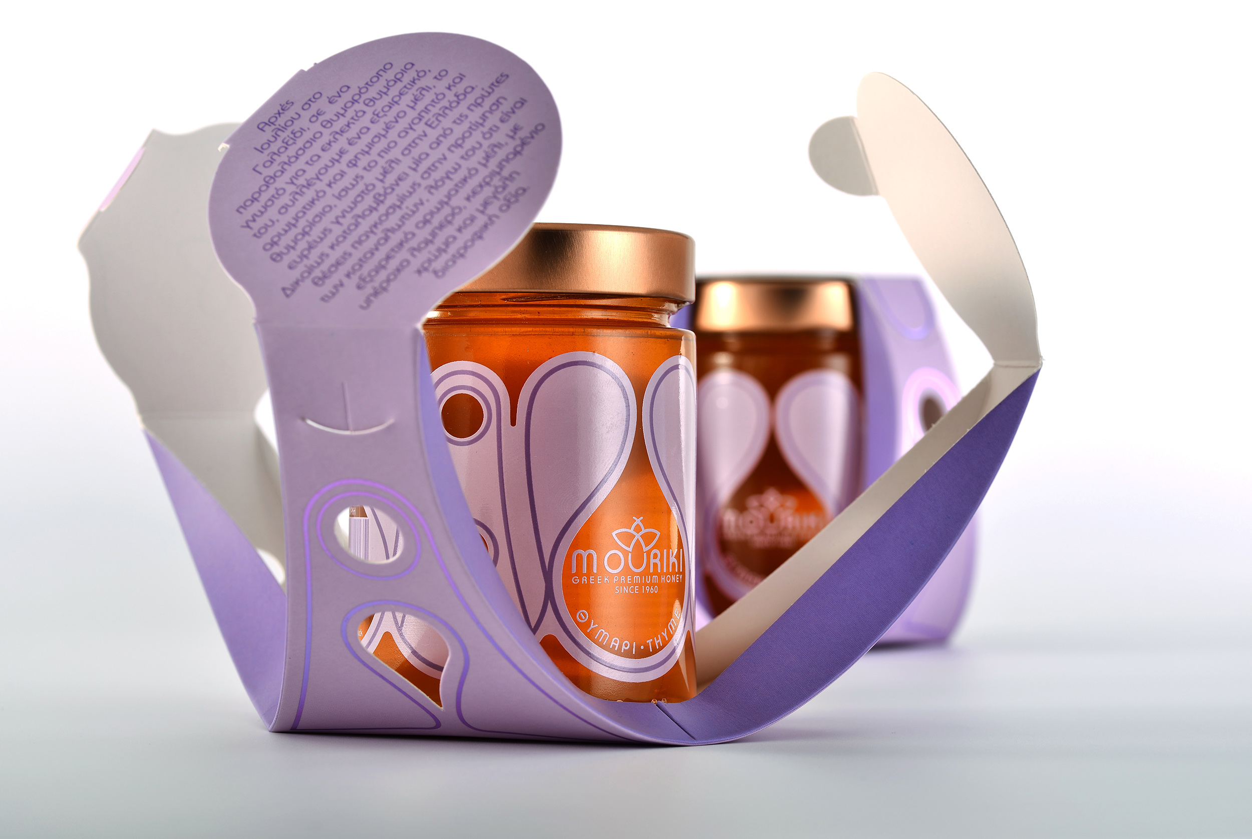
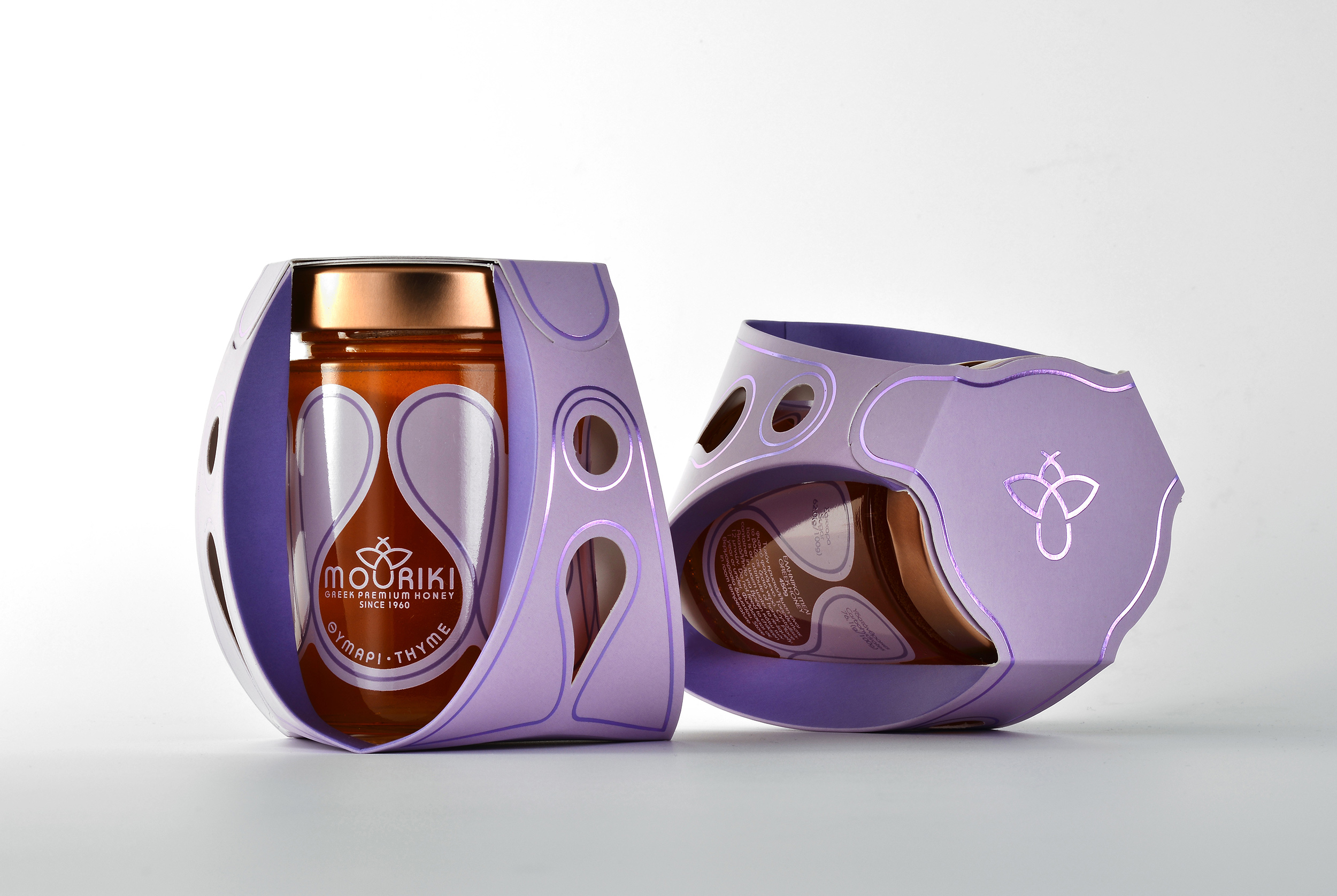
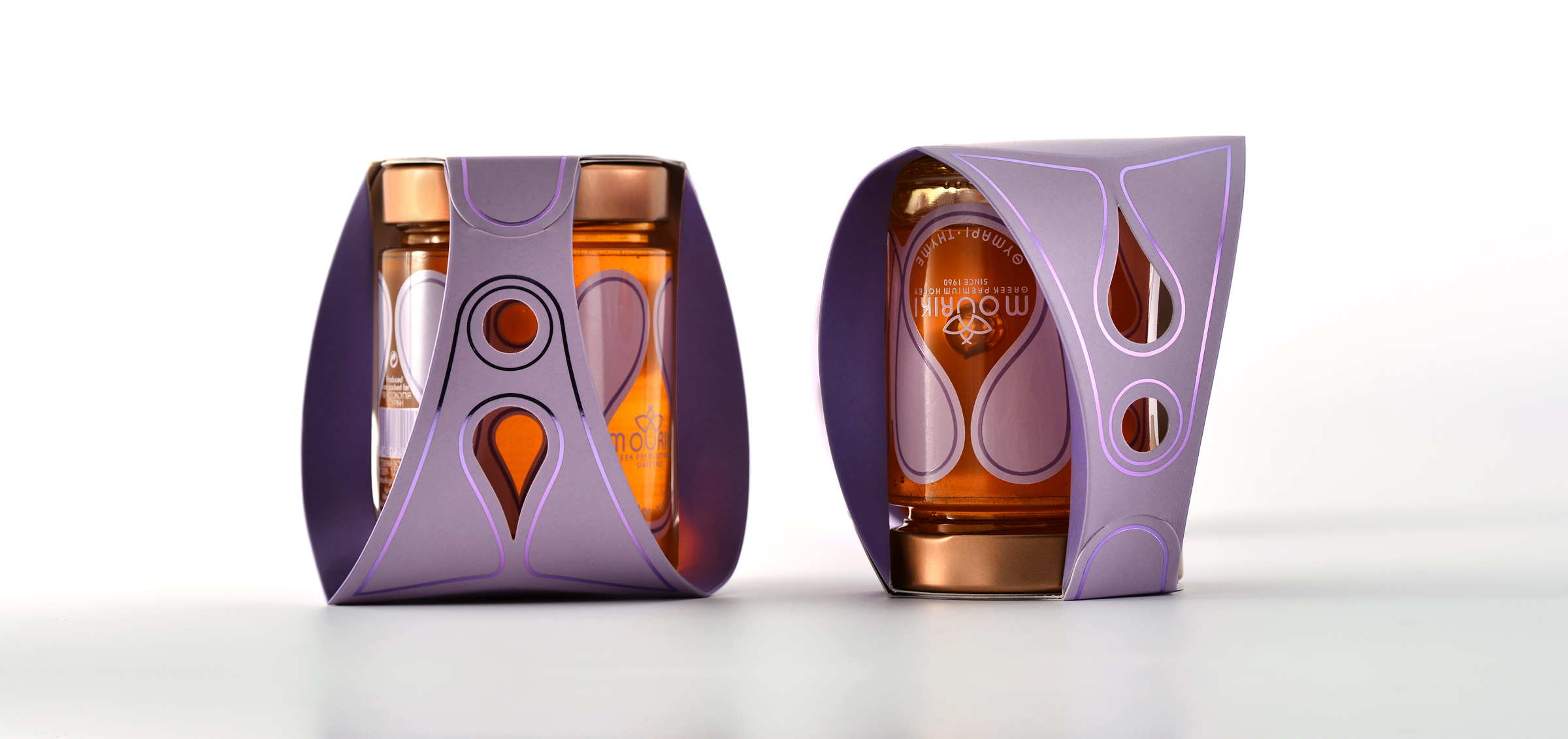
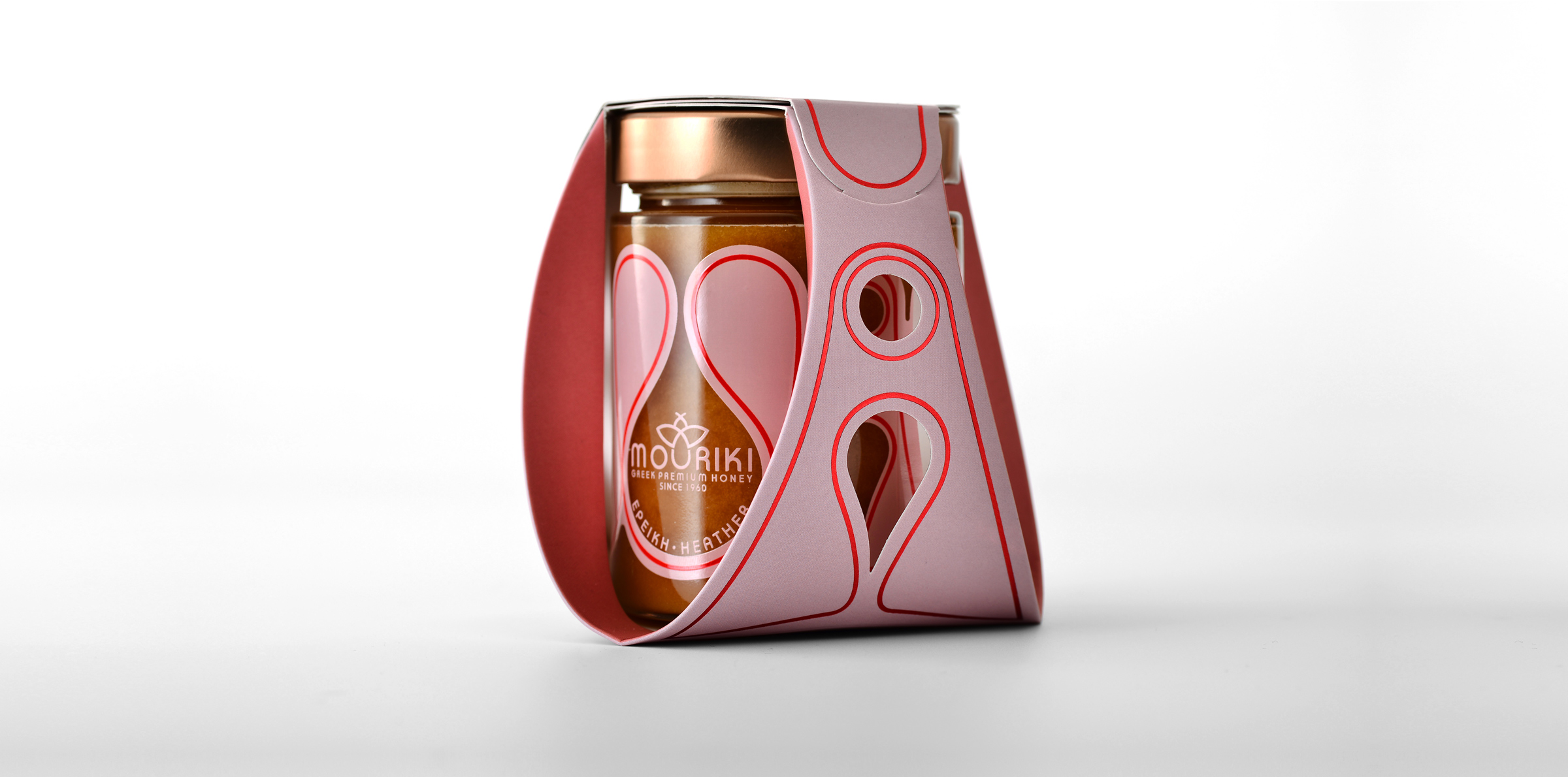
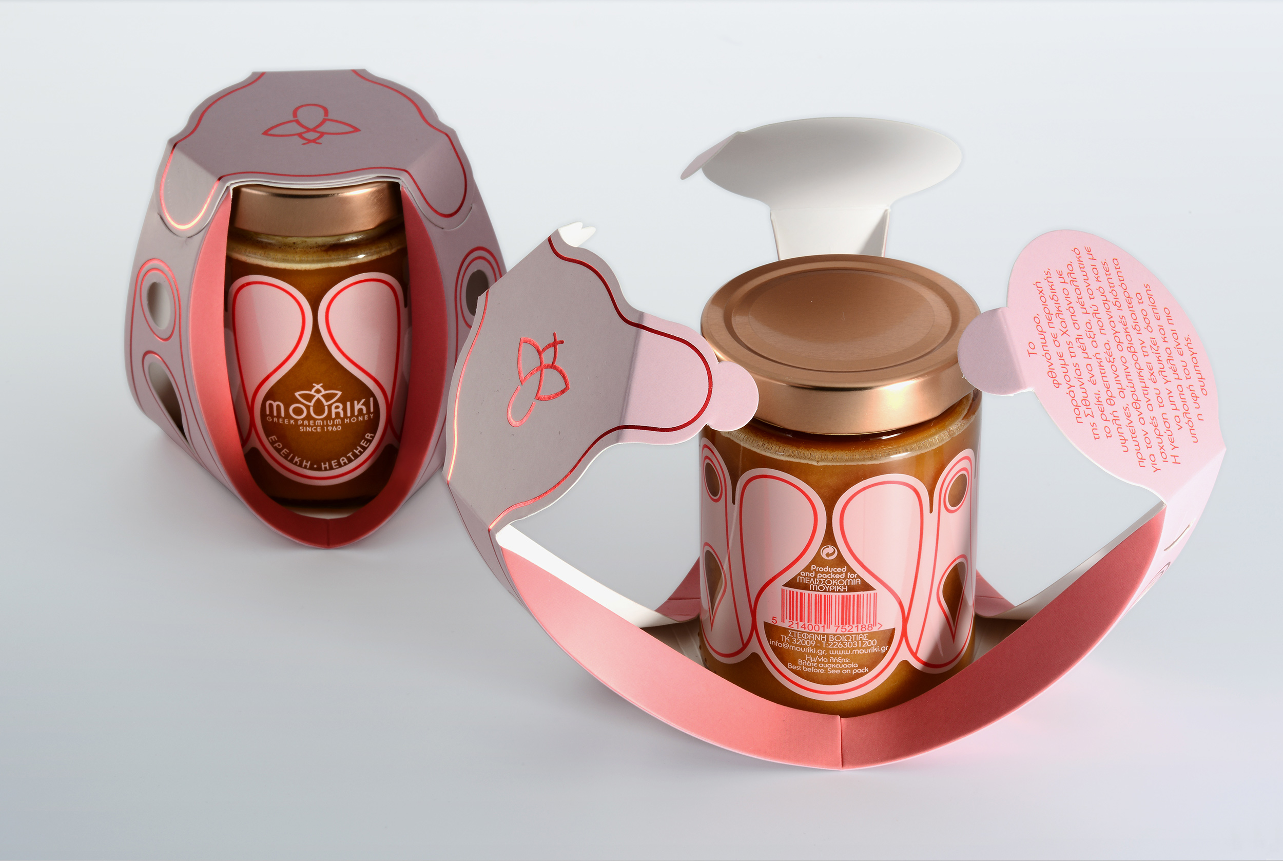
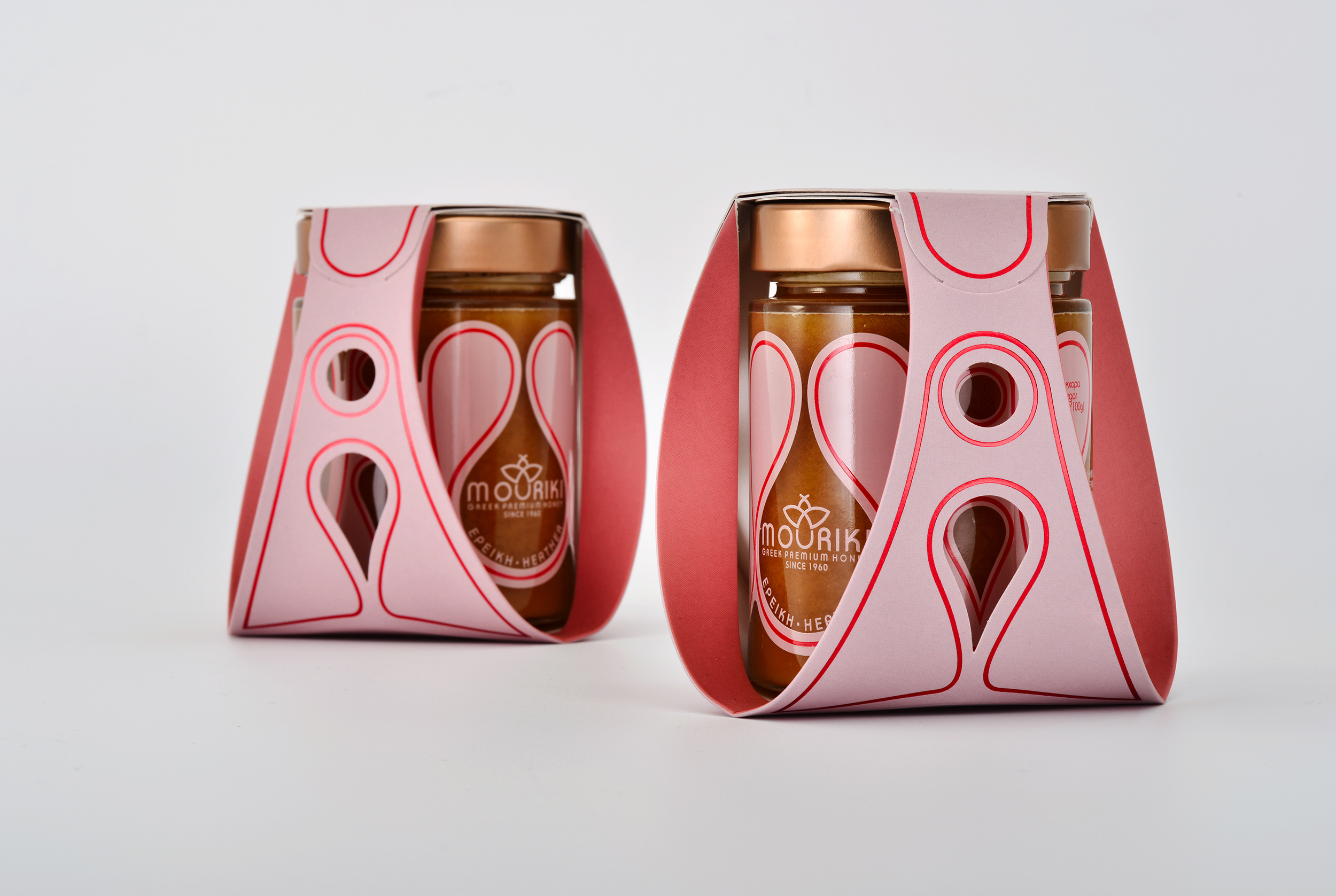
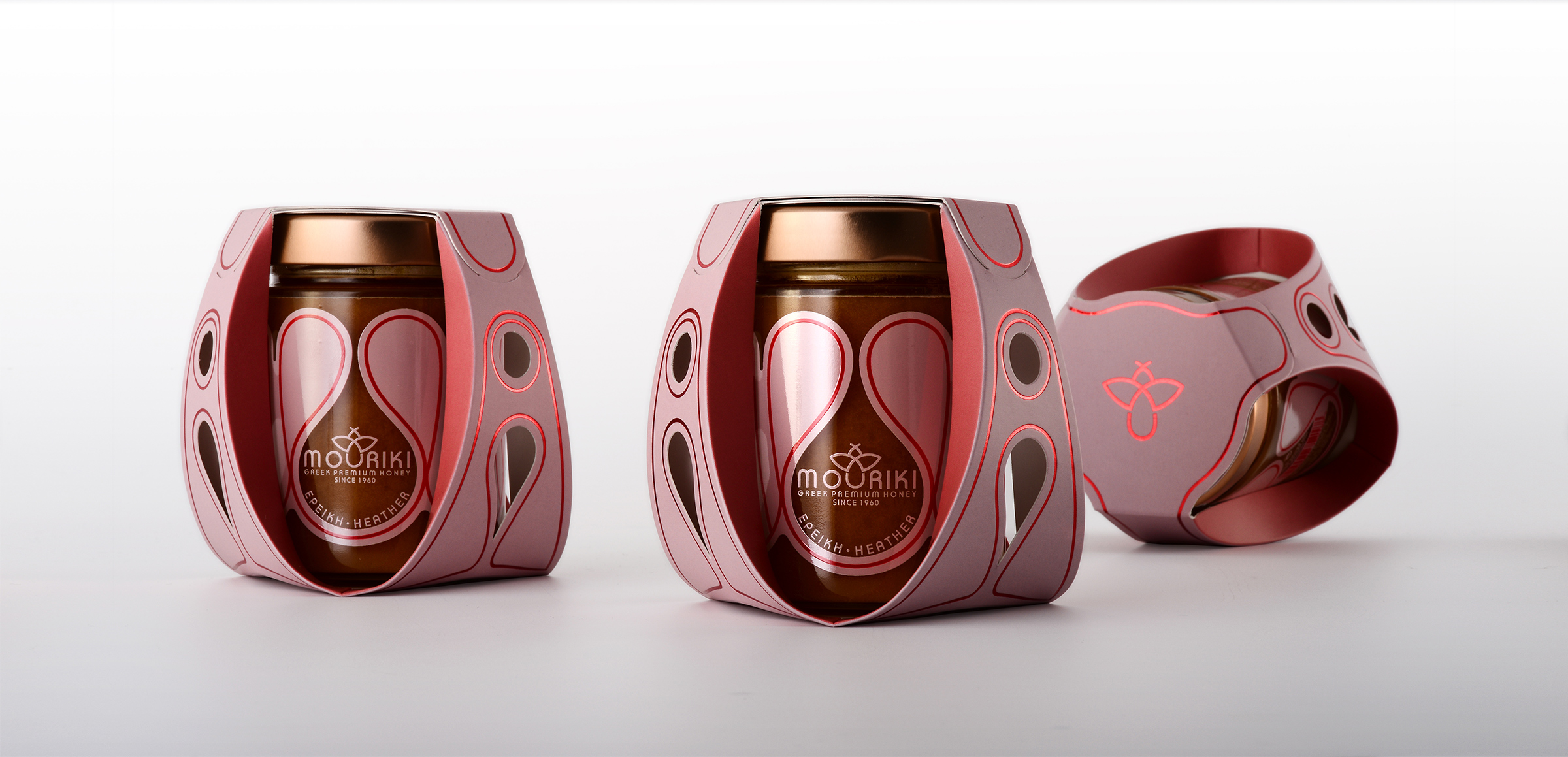
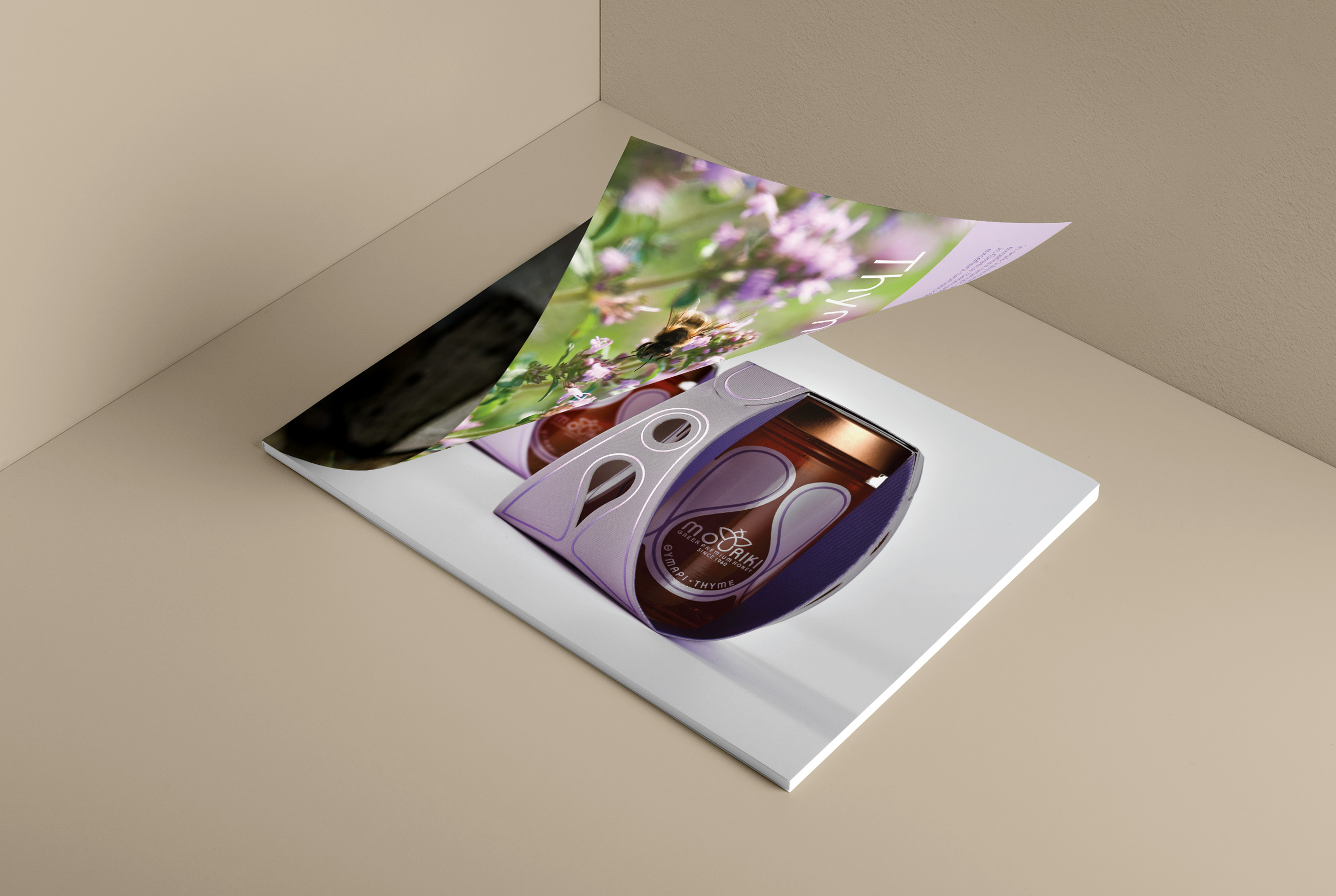
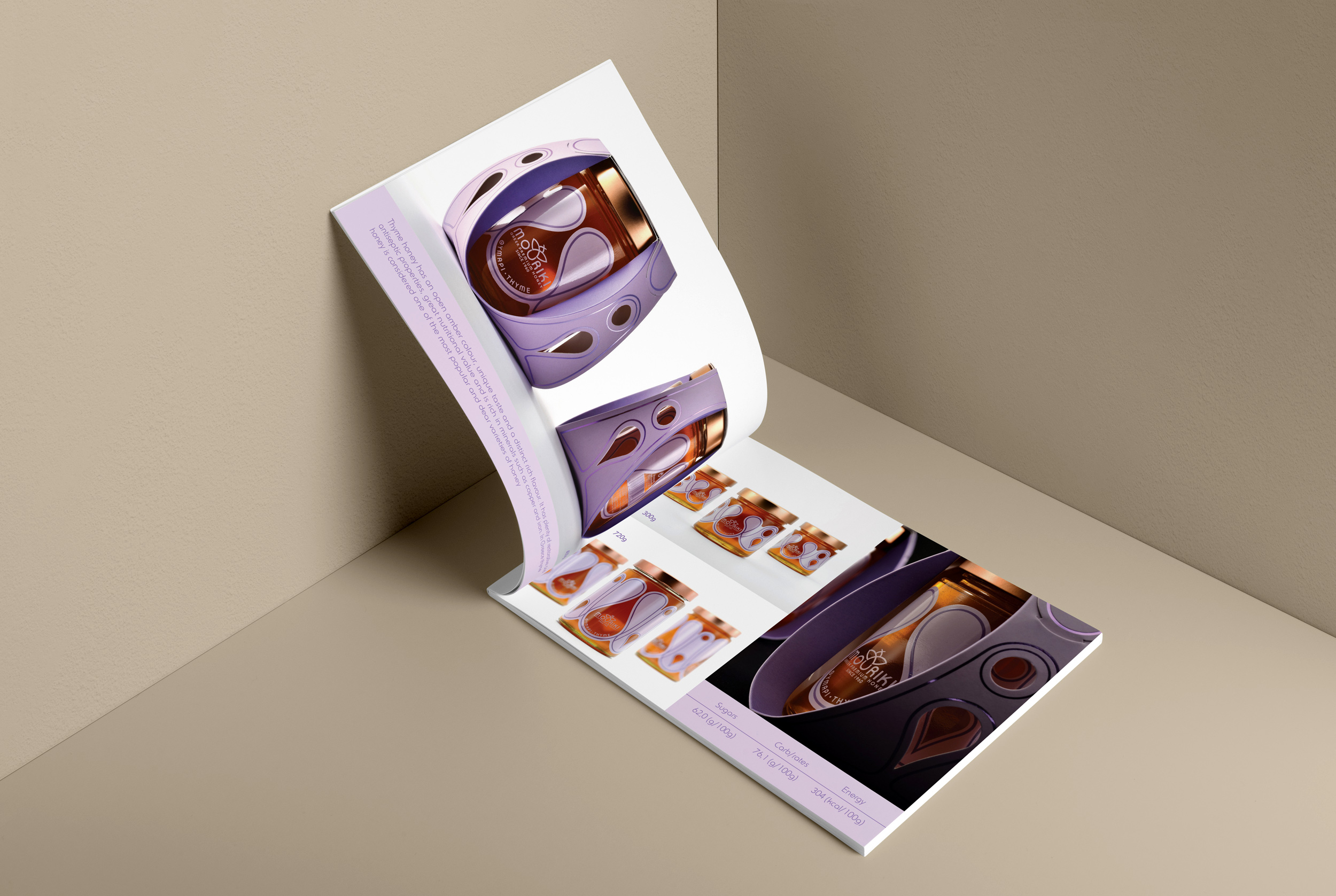
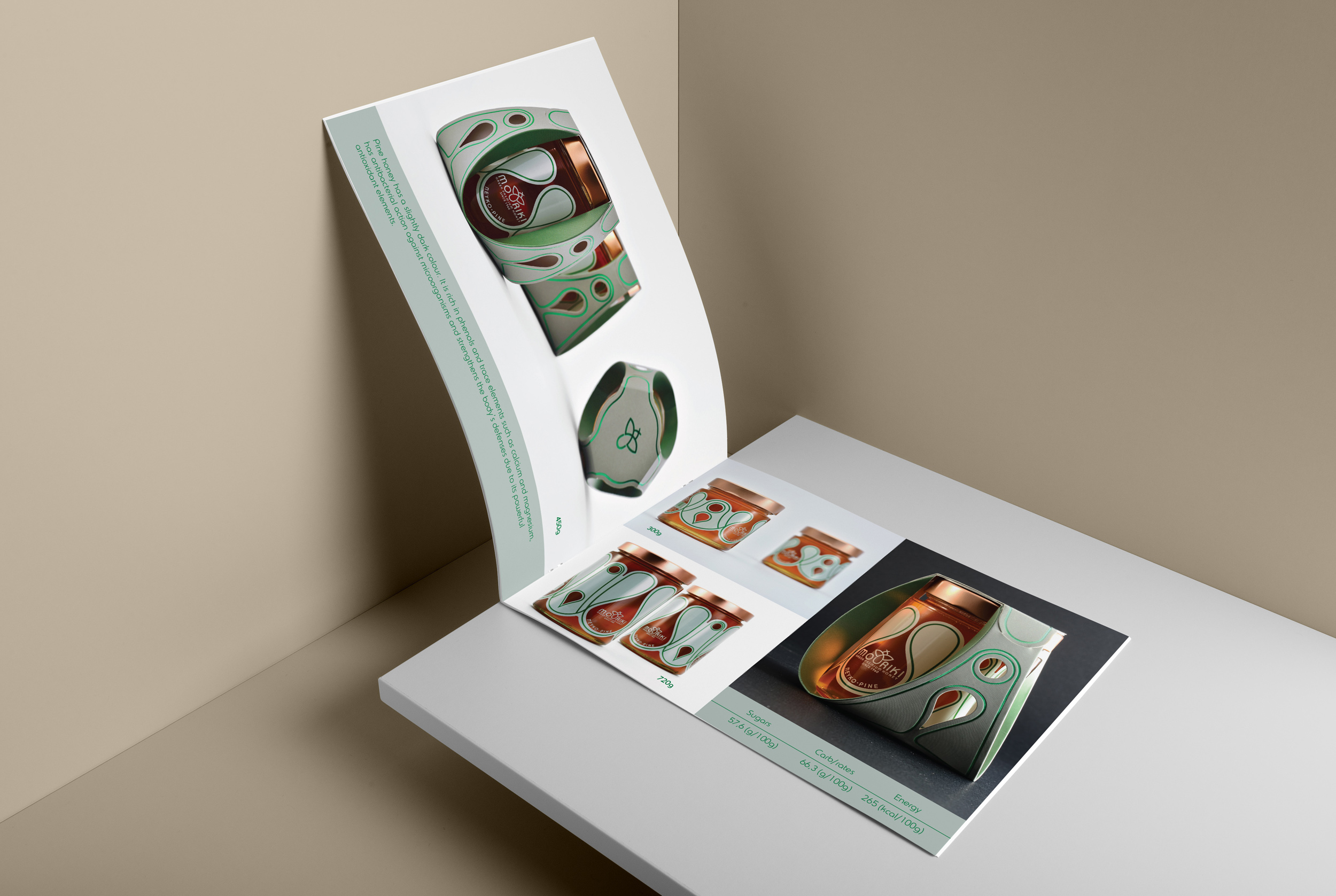
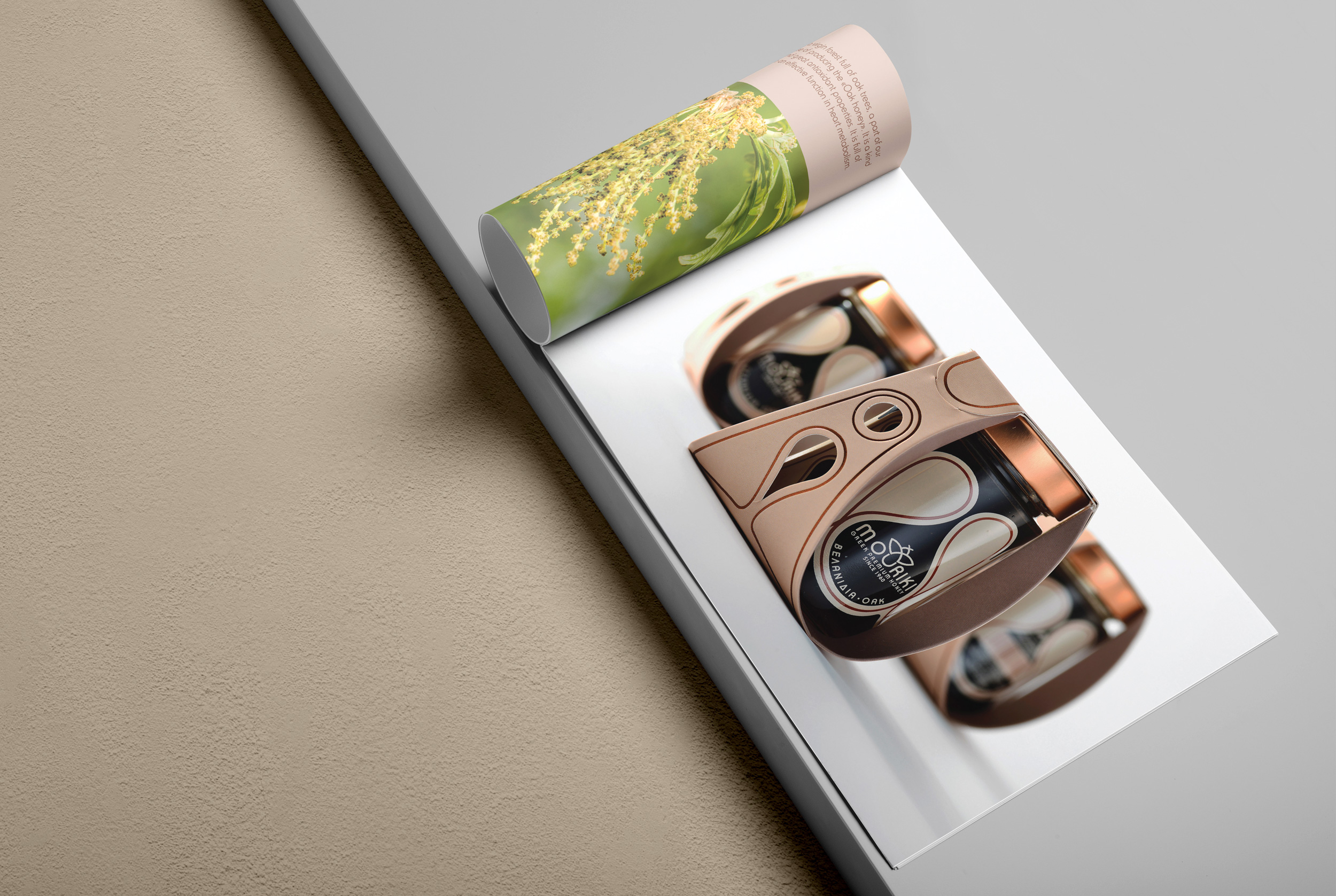
Following the development of the company identity, we engaged with the packaging. Through experimenting in the quest for a design solution for the exterior paper packaging, we constructed an innovating structure comprised of 3 wide openings on the surface that reveal the glass jar and its decorations. The 3 openings align with the company logo; the three radii that form the body and 2 wings of the bee.
For the closing of the packaging, mechanic clasps on the paper have been incorporated, so that glue is not required.
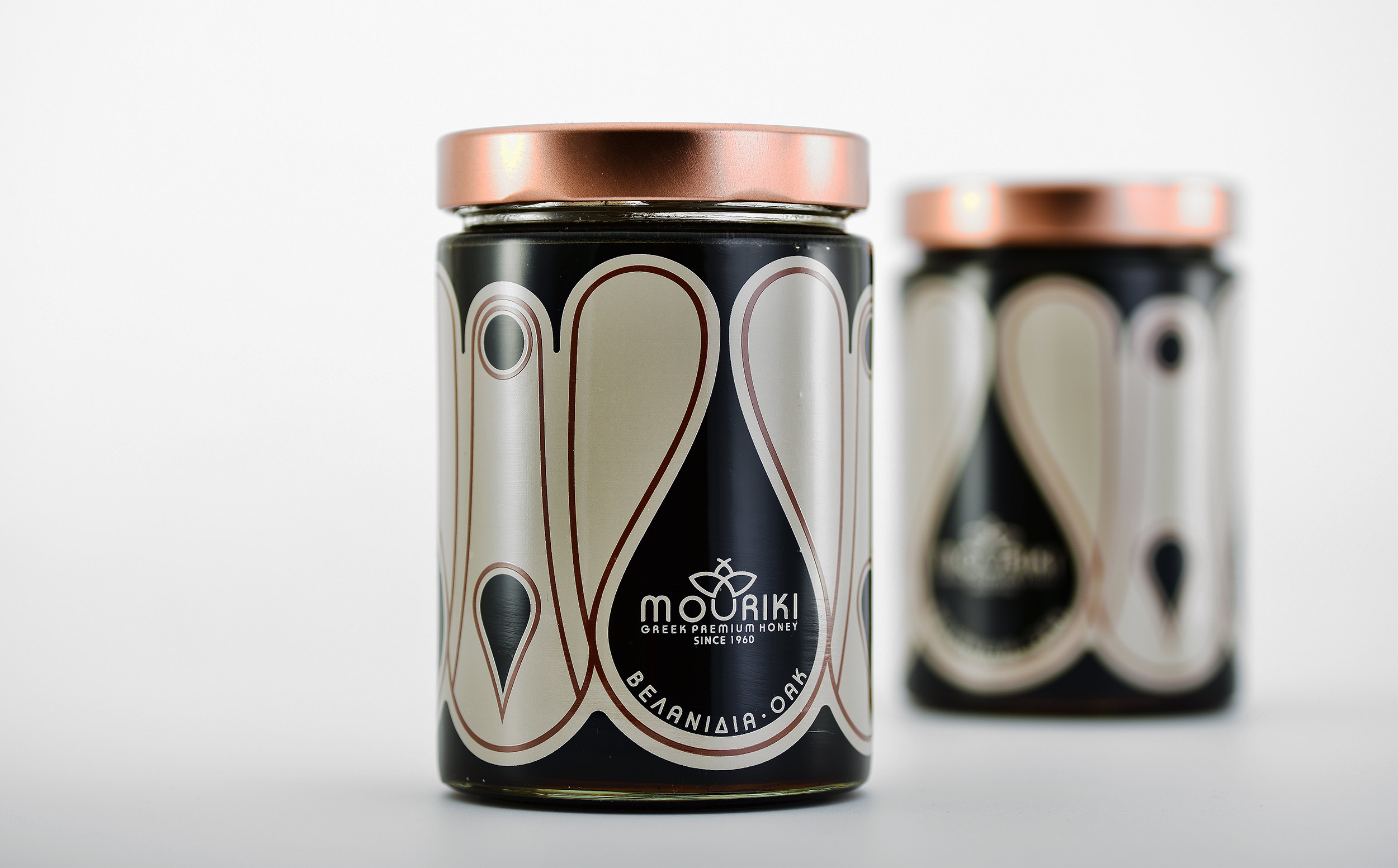
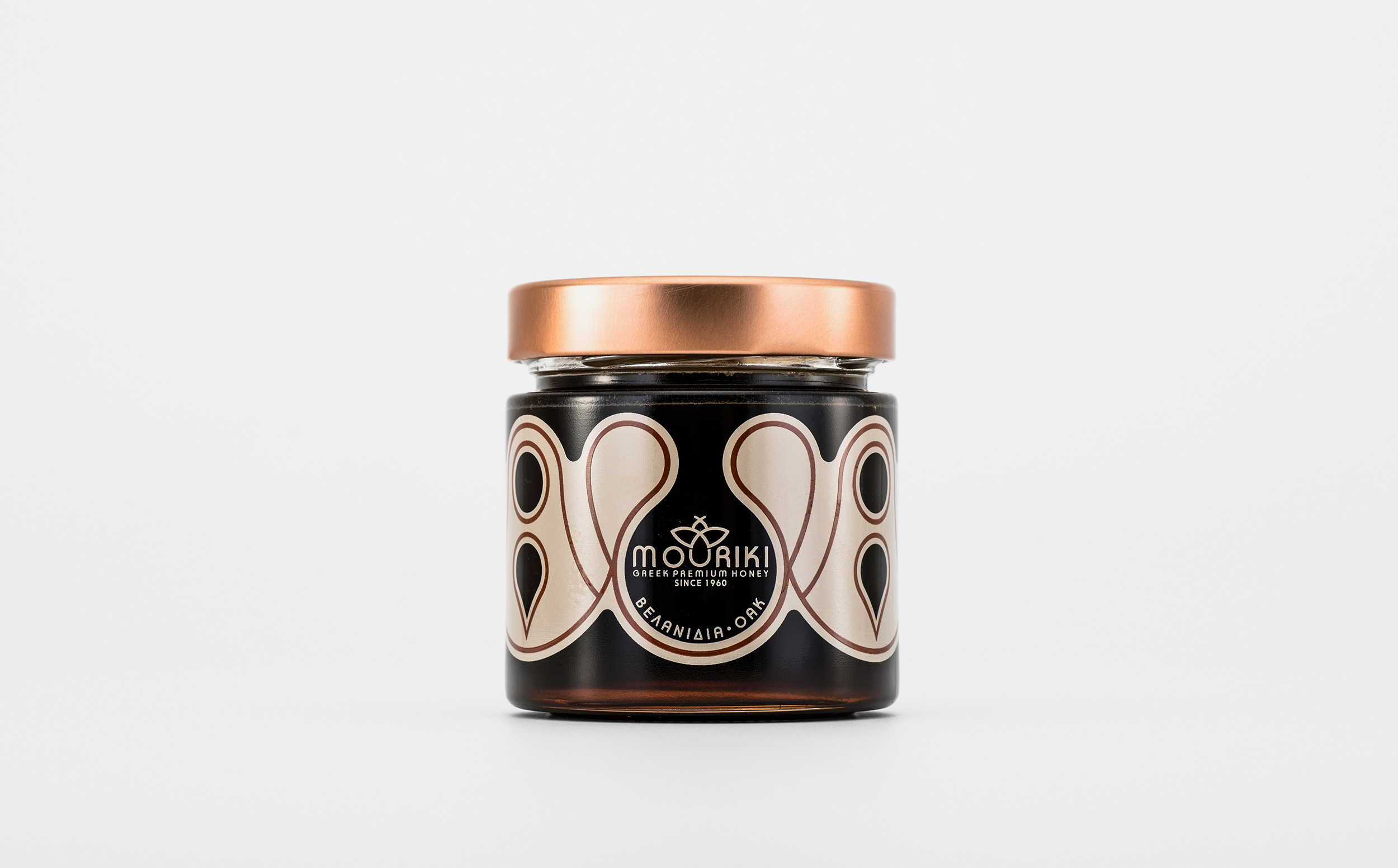
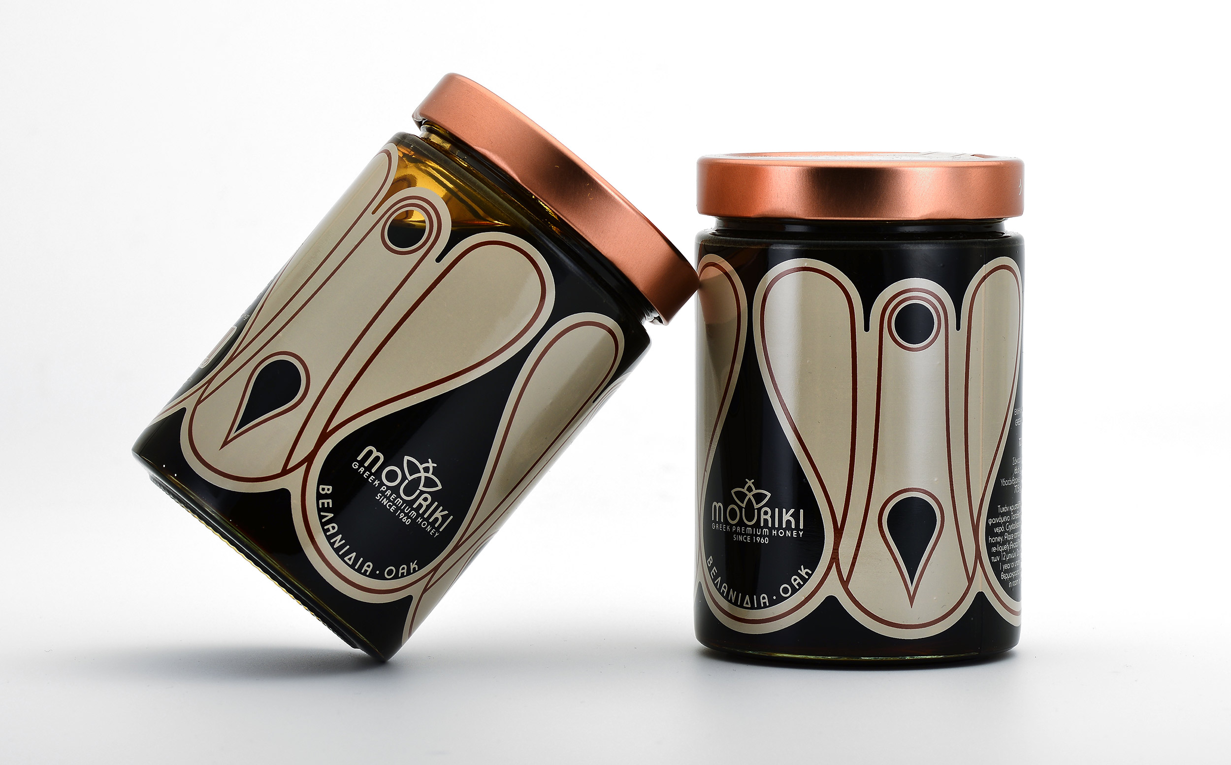
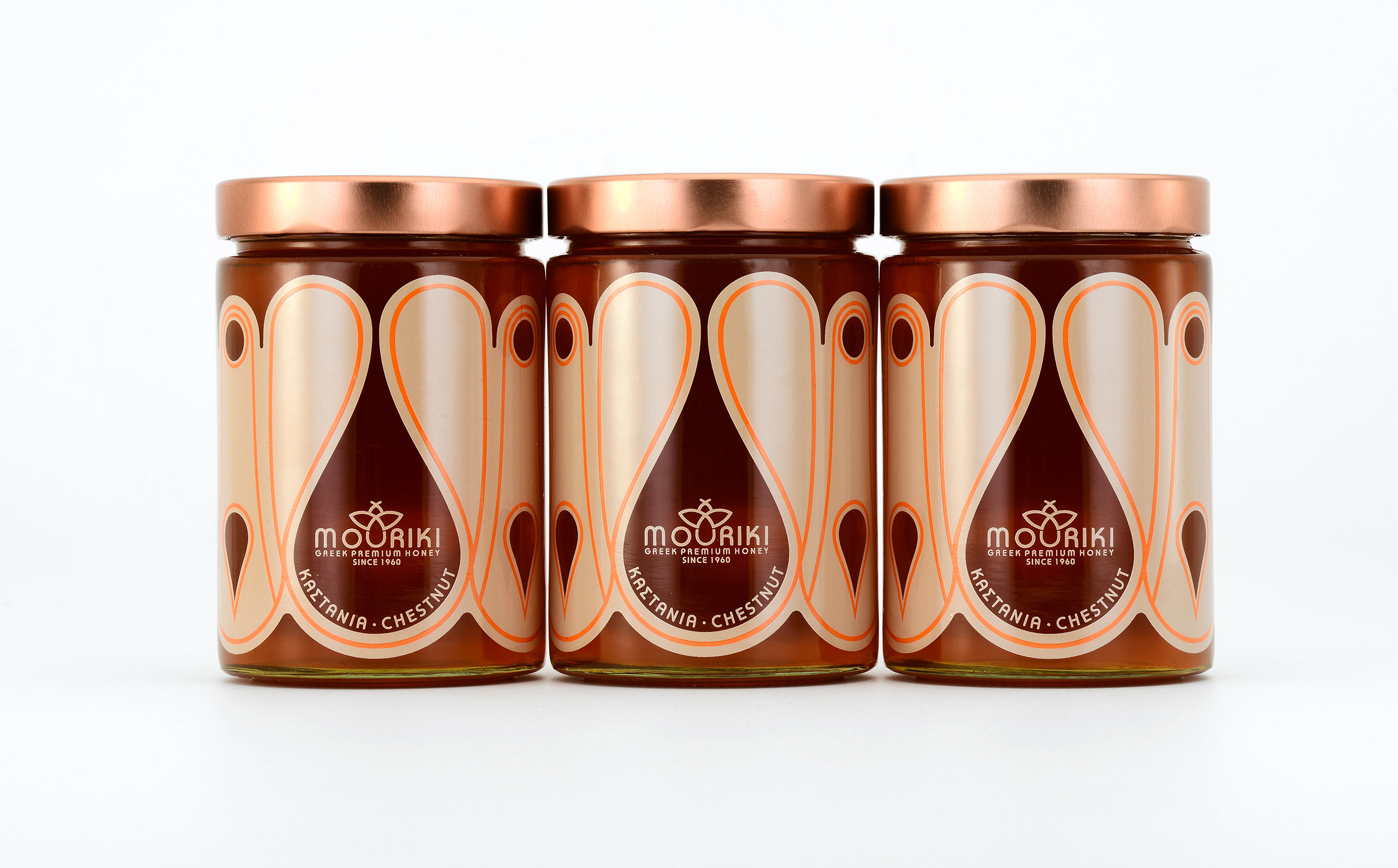
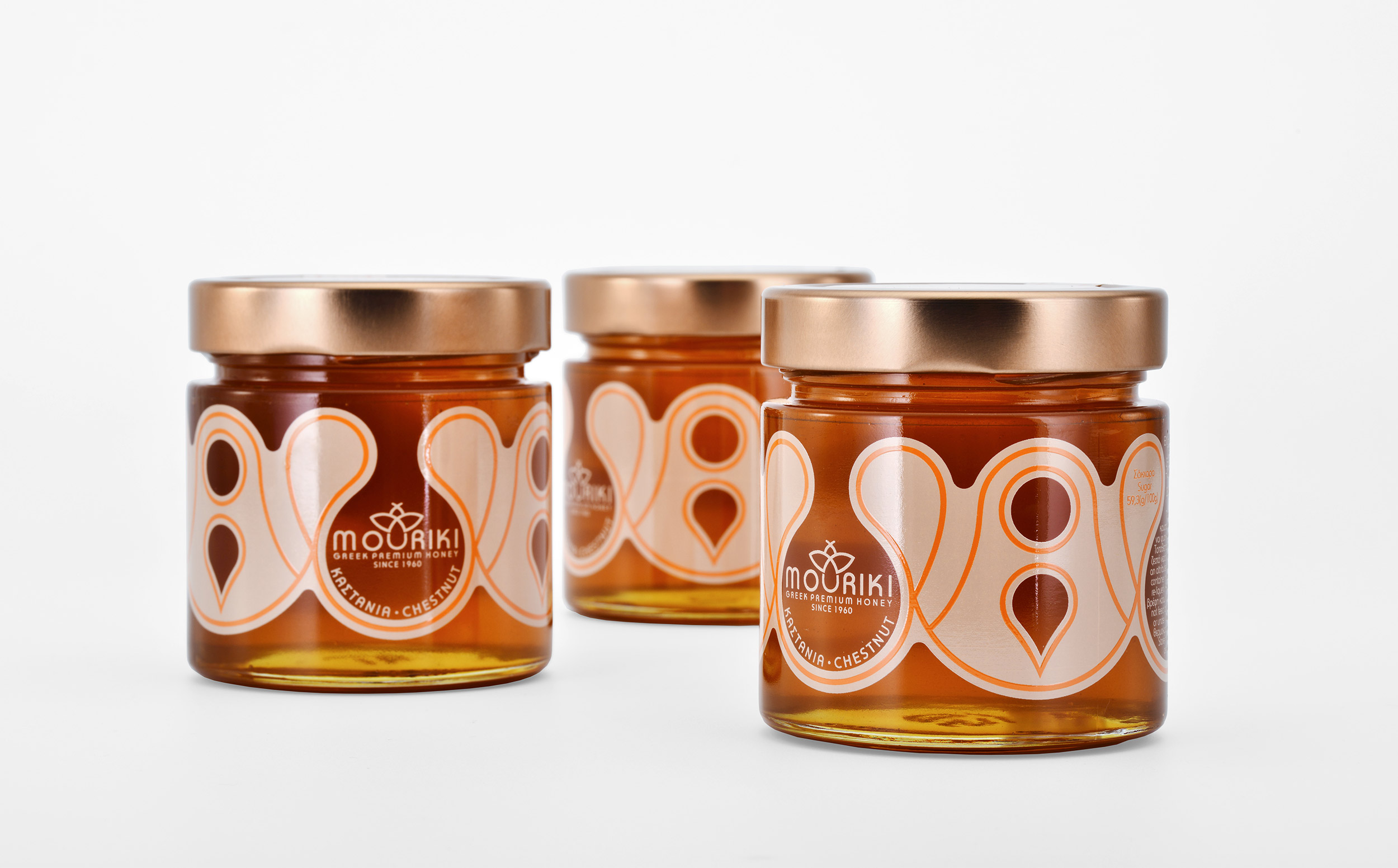
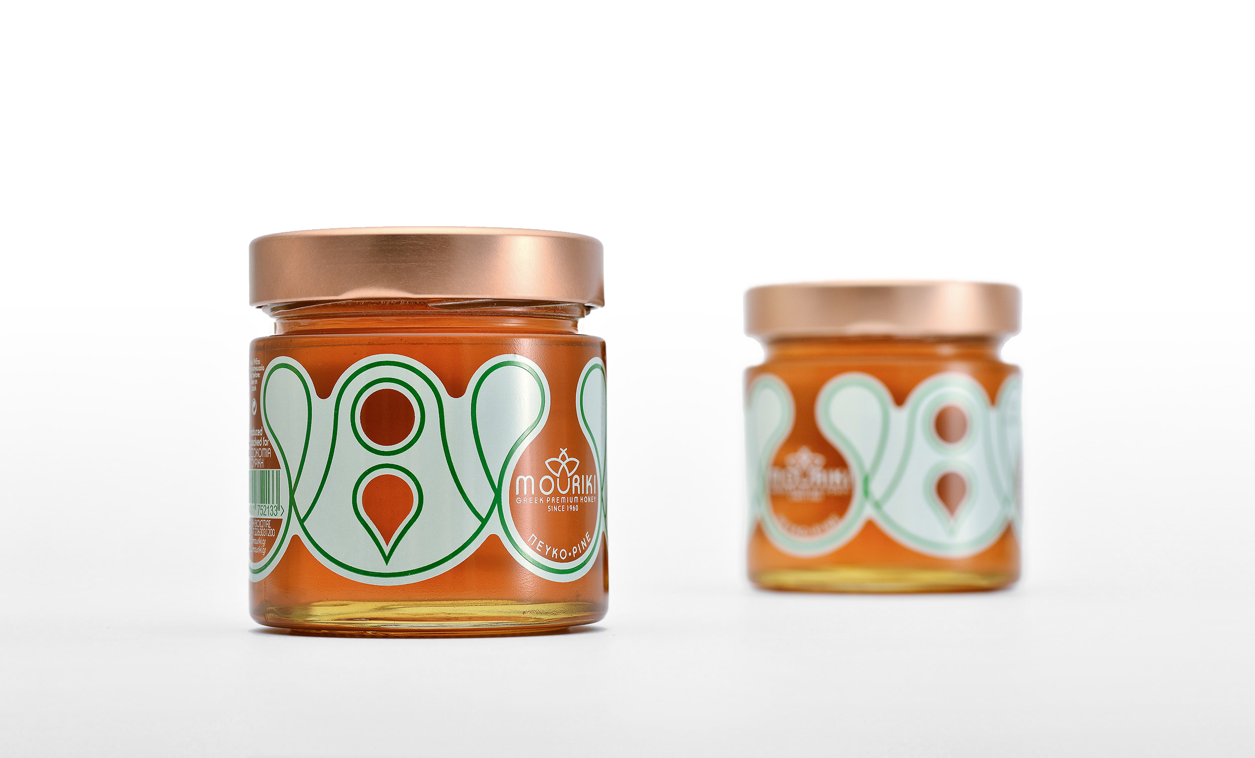
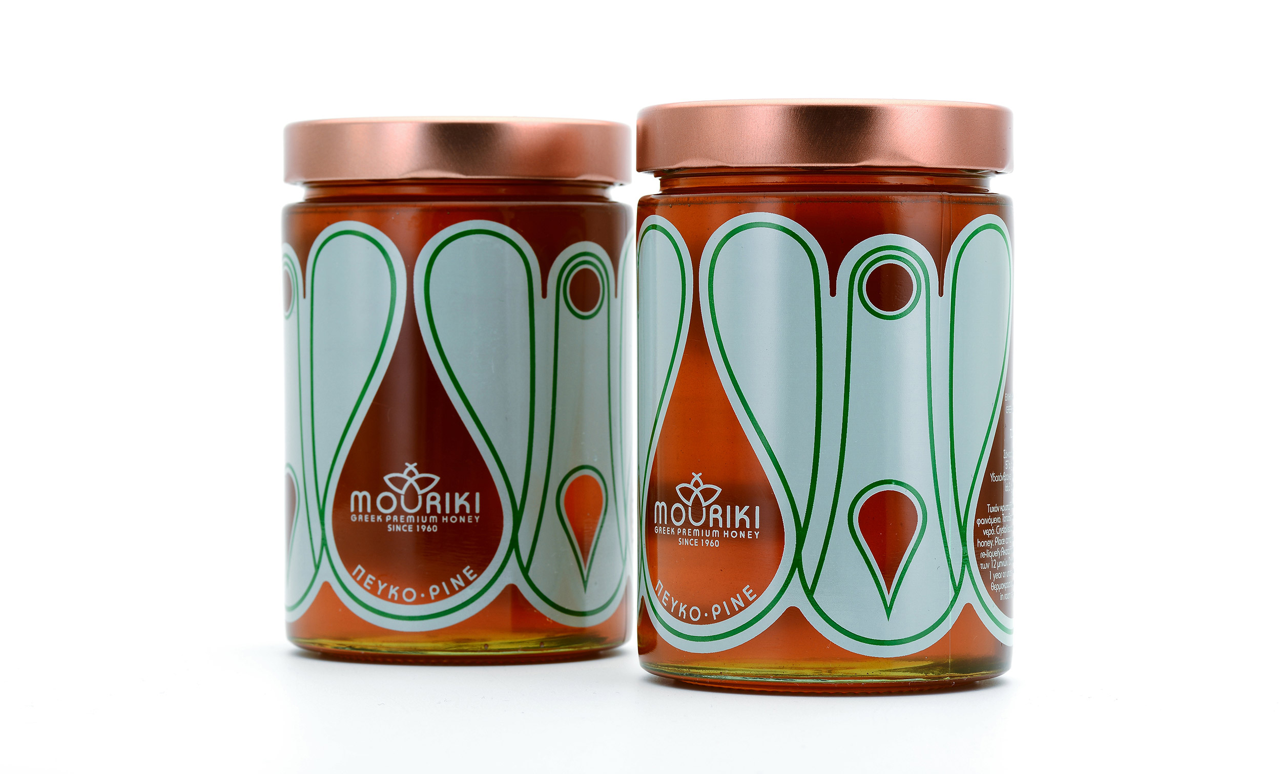
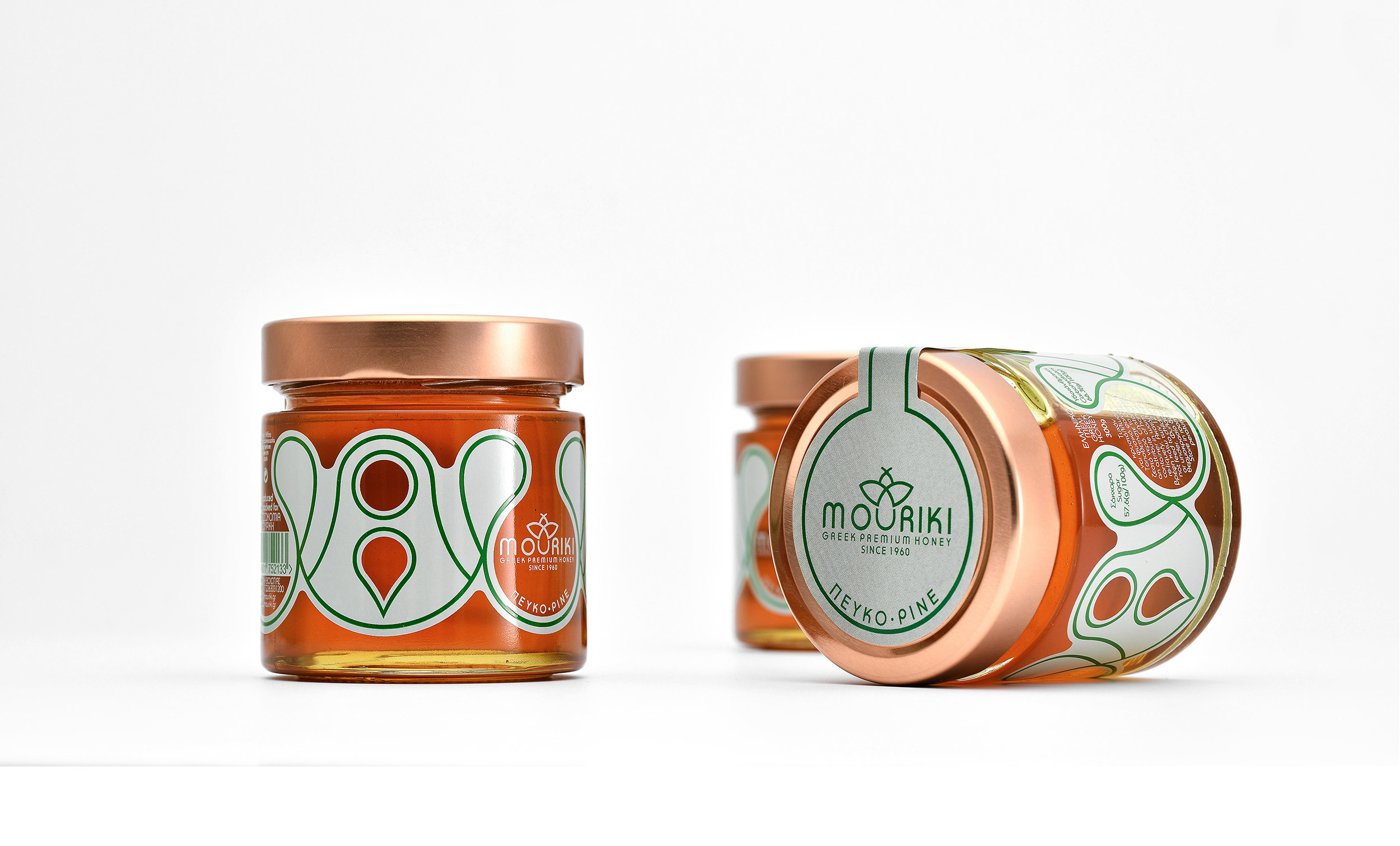
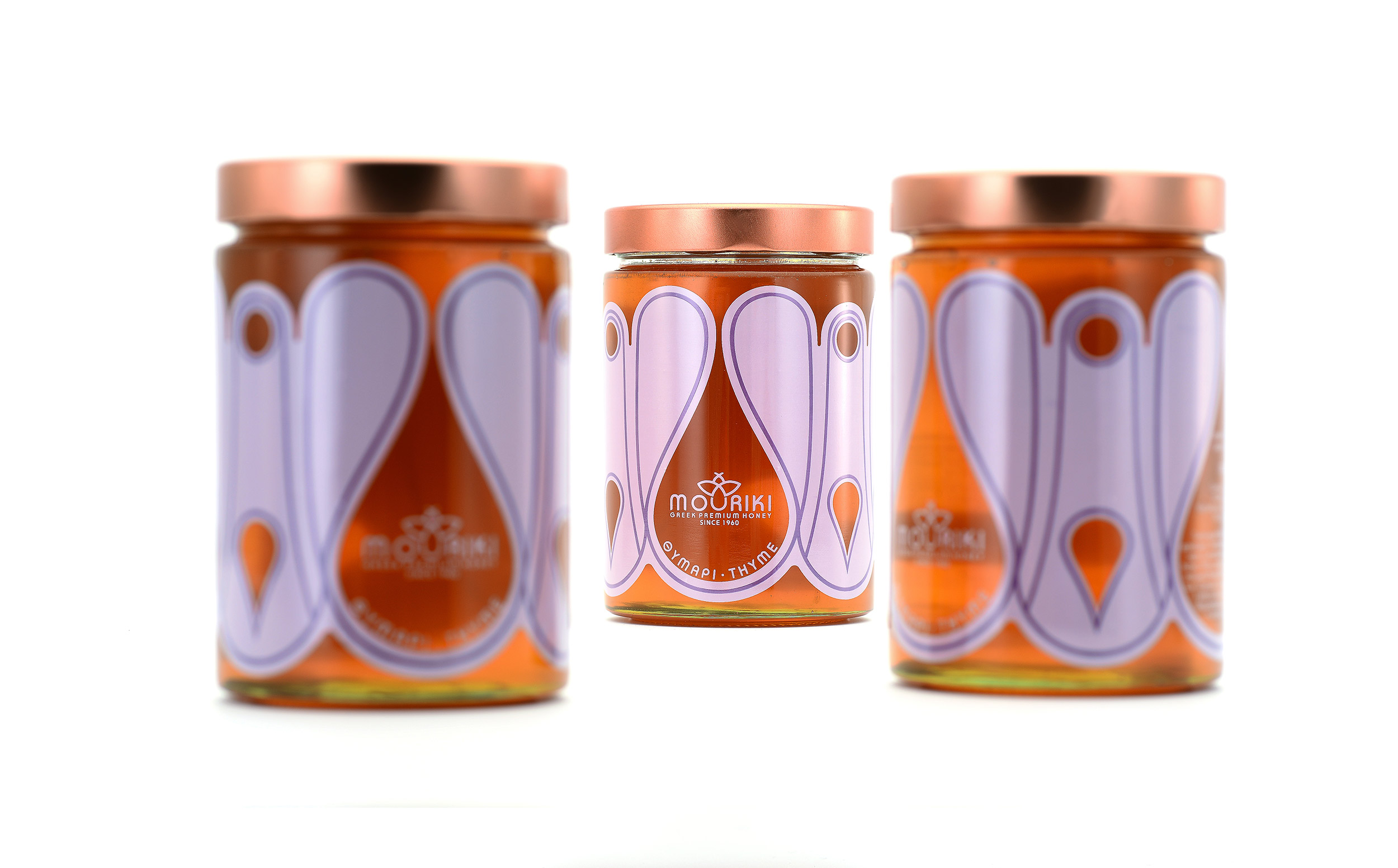
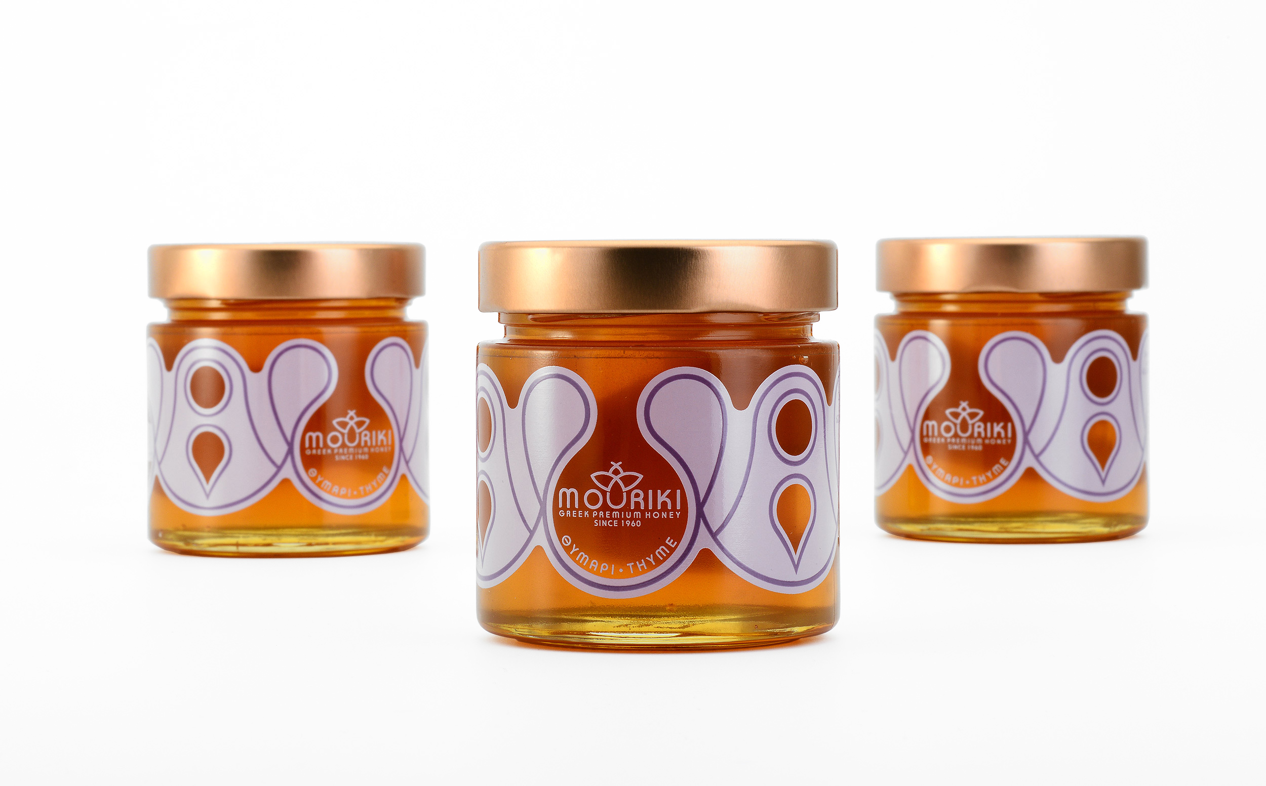
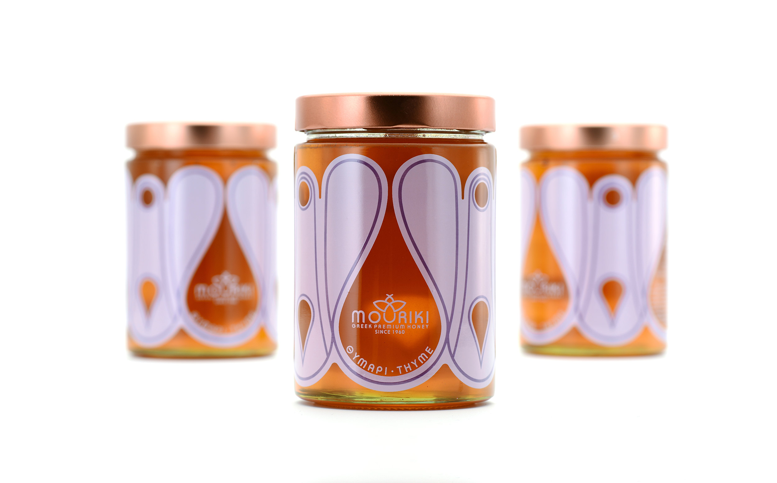
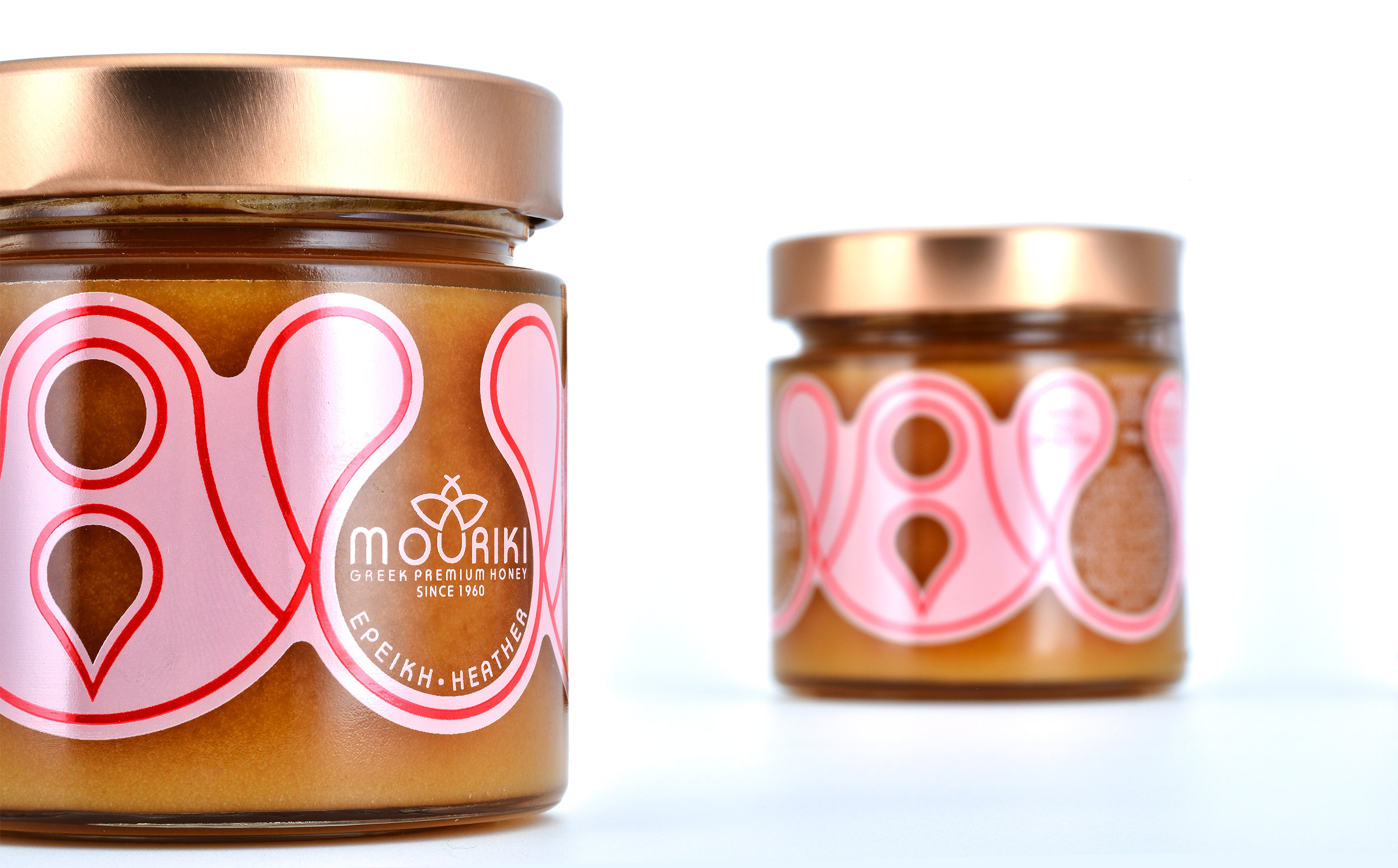
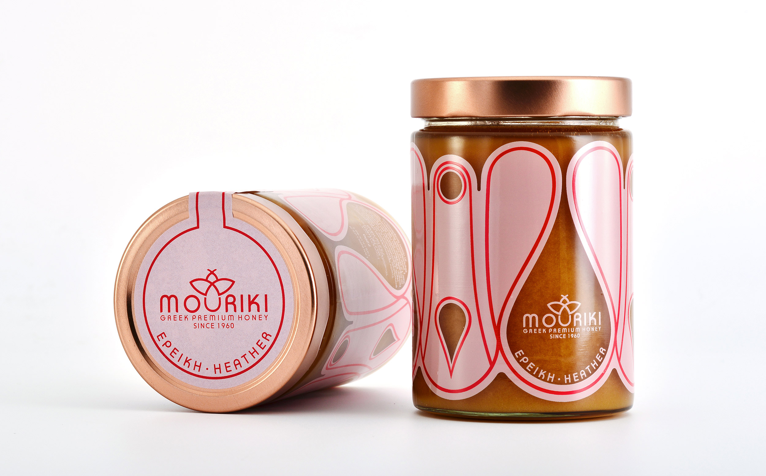
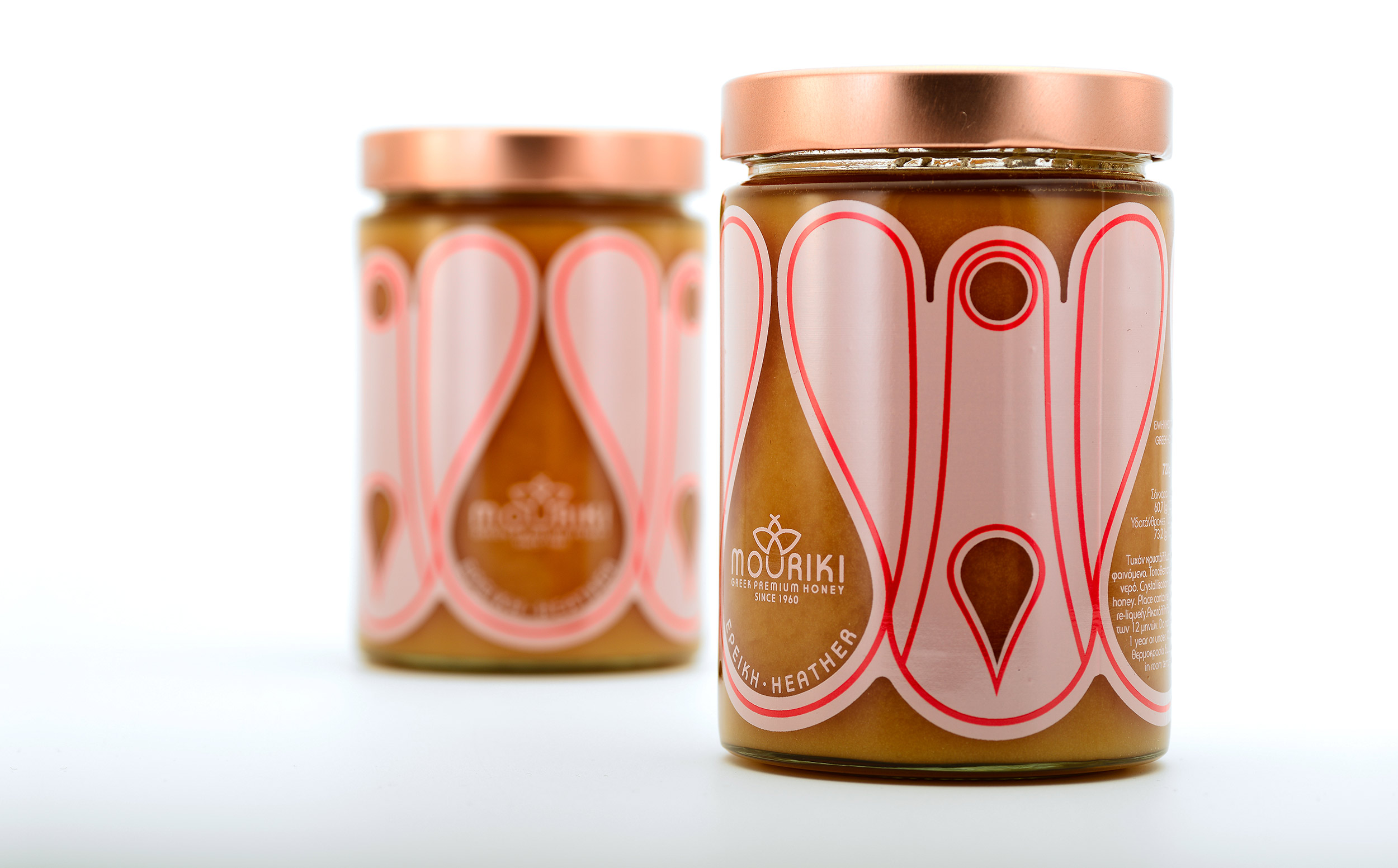
The final design is accompanied by the geometric decorations on the jar, which also has many transparent areas that features the natural colour of the product. (Silkscreen/2 colors)
The outside packaging adopts influences from the Japanese art of origami, while the formalism of the French art nouveau is employed for the illustration of the paper structure and the glass jar.
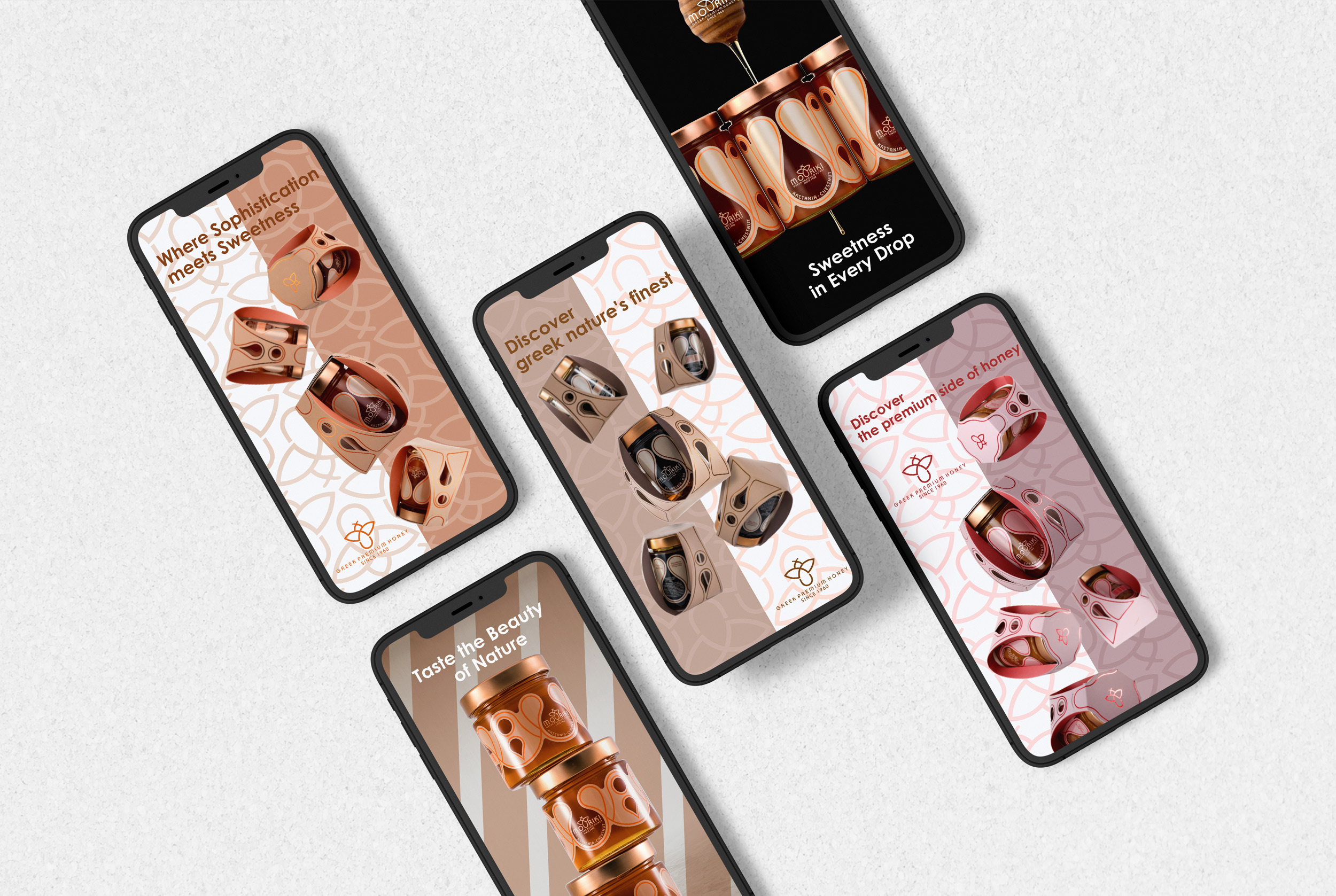
For the differentiation among the 5 honey varieties (pine, chestnut, heather, oak, thyme), we created 5 different colour palettes, inspired by hues associated with the flowers of each variety.
Services